What is a tint in art?
Short answer
A tint is a color produced by mixing a pure hue with white, which increases its lightness and reduces its saturation. In color theory, tints are essential for creating highlights, softening harsh tones, and adding depth to a composition. They represent the lighter end of the value scale in painting and design.
On this page
What is the difference between a tint, shade, and tone?
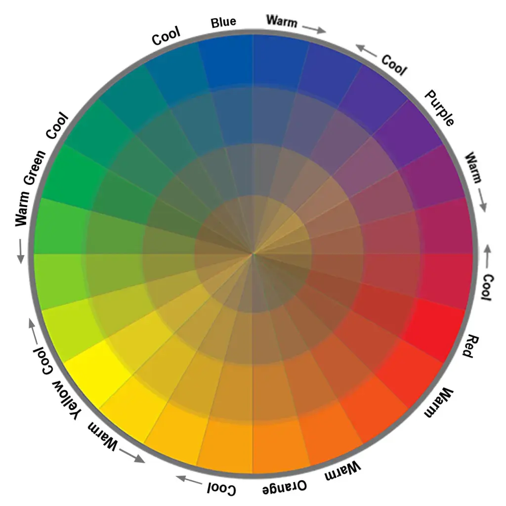
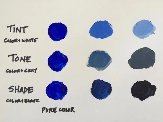
In color theory, the terminology used to describe color variations depends entirely on what is added to the original pigment. A tint is exclusively the result of adding white to a hue, which raises its value and makes it appear softer or more pastel. Conversely, a shade is created by adding black to a hue, which lowers the value and creates a darker, more intense appearance.
A tone is slightly more complex, as it is produced by adding gray—a mixture of both black and white—to a hue. While tints are light and airy, shades are moody and deep, and tones are generally more muted and subtle. Understanding these three categories allows artists to manipulate the emotional impact of their work. By mastering the relationship between these variations, you can create a full range of values that make a two-dimensional surface appear three-dimensional.
How to create a tint using paint
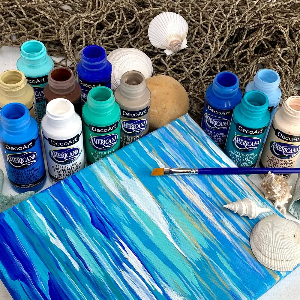
Creating a tint is a fundamental skill for any painter, whether you are working with oils, acrylics, or watercolors. The process requires a systematic approach to ensure you achieve the desired lightness without muddying the pigment. Because white paint is often highly opaque, it can easily overpower a dark or highly saturated color if added too quickly.
- Start by placing a small amount of your base hue on your palette.
- Add a very small amount of white paint to the side of your hue.
- Gradually pull tiny amounts of the white into the hue using a palette knife or brush.
- Mix thoroughly until the color is consistent, and continue adding white until you reach the desired level of brightness.
Always remember that it is much easier to add more white to darken a tint than it is to add more pigment to lighten a mixture that has become too pale. Working slowly ensures you do not waste expensive paint while trying to find the perfect balance.
Why do artists use tints in their work?
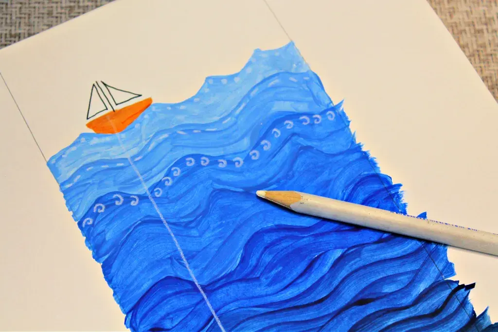
Artists utilize tints to establish light sources and create the illusion of volume within a painting. When light hits an object, the area facing the light source is naturally lighter than the rest of the form. By applying tints to these areas, an artist can simulate the effect of sunlight or artificial illumination, effectively turning a flat shape into a rounded, realistic object.
Beyond technical modeling, tints are used to influence the psychological mood of a piece. Tints are often associated with feelings of calmness, innocence, or ethereal beauty because they lack the aggressive intensity of pure, saturated colors. In landscape painting, artists often use tints to depict atmospheric perspective. As objects recede into the distance, they appear lighter and less saturated due to the particles in the air, a technique known as aerial perspective that creates a sense of immense scale and depth.
Common mistakes when mixing tints
One of the most frequent errors beginners make is using a dirty brush or palette knife to mix their colors. If your tool has remnants of a dark color, such as blue or brown, it will contaminate the white paint, resulting in a dull or "muddy" tint. Always clean your tools thoroughly before mixing a new tint to maintain the clarity and brilliance of your colors.
- Failing to mix enough paint: If you run out of a specific tint halfway through a painting session, it is nearly impossible to recreate the exact same shade.
- Over-mixing: Stirring too vigorously or for too long can sometimes introduce air bubbles or cause the paint to lose its texture.
- Ignoring the temperature: Remember that white paint can sometimes have a cool or warm undertone, which may subtly alter the final appearance of your tint.
- Using too much white: Adding white too aggressively can quickly turn a vibrant color into a flat, chalky mess that lacks character.
Best practices for using tints in design
In graphic design and digital art, tints are used to create hierarchy and improve readability. A background tinted with a neutral white can make dark text stand out, while tinted buttons or icons can guide a user's eye toward specific calls to action. When working digitally, you can achieve a tint by increasing the lightness value in the HSL (Hue, Saturation, Lightness) color model.
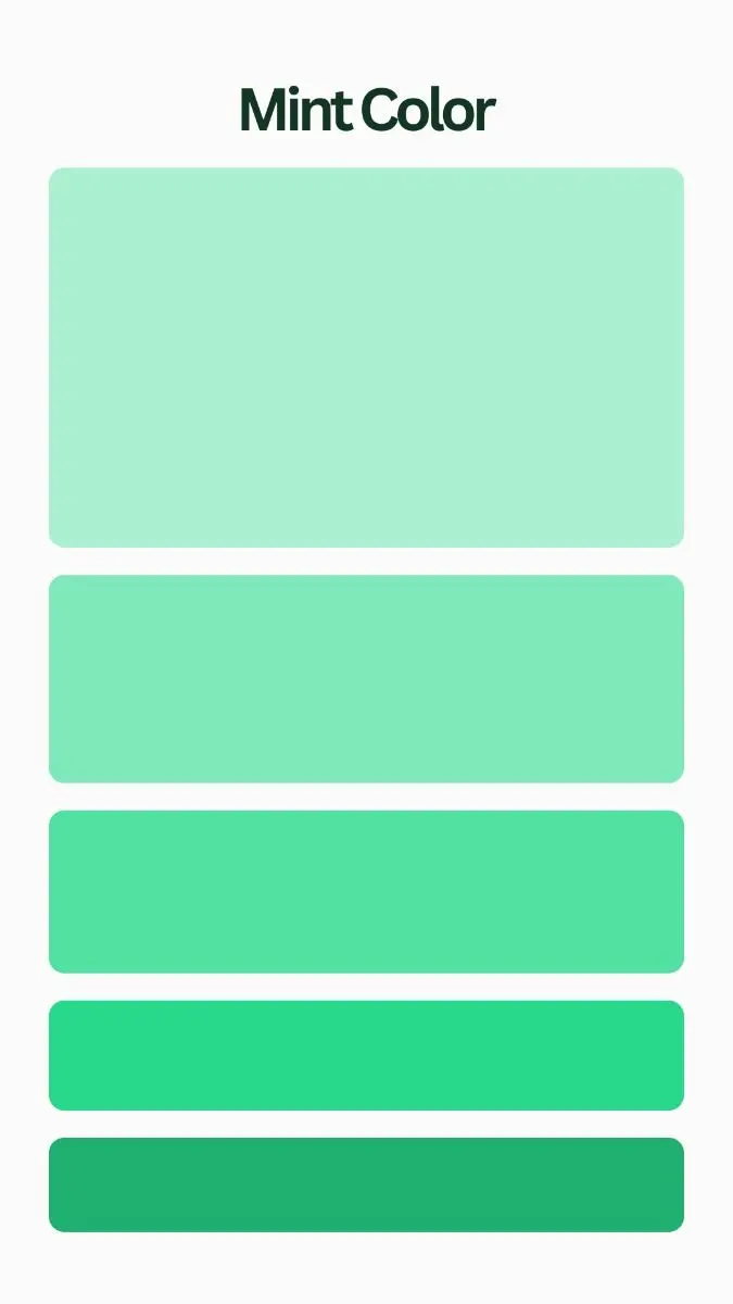
When designing, consider the "tint scale," which is a series of tints of the same hue ranging from very pale to almost full saturation. Using a consistent tint scale across a project provides a sense of harmony and professional polish. Avoid using too many different tints in a single layout, as this can make the design feel cluttered or confusing. Instead, choose one or two base hues and create a palette of 3-4 tints for each to maintain a clean, organized visual structure that effectively communicates your message to the viewer.
Key facts
- A tint is created by mixing any pure color, or hue, with white paint.
- Adding white increases the value of the color, making it appear lighter and less saturated.
- Tints are essential for creating highlights, soft lighting effects, and a sense of depth in paintings.
- When mixing, always add a small amount of color into a larger pile of white to avoid wasting paint.
- Tints are often used in portraiture to create skin tones or to soften harsh shadows.
- Avoid over-mixing tints, as this can make the color look "chalky" or dull on the canvas.
The bottom line
A tint is a fundamental tool for artists, achieved by lightening a pure hue with white. By adjusting the ratio of white to pigment, you can create a vast spectrum of soft, luminous colors perfect for highlights and atmospheric effects. Mastering the art of tinting allows for greater control over light and volume, helping you move beyond basic colors to create sophisticated, professional-grade compositions in your artwork.
People also ask
What is the difference between a tint, a shade, and a tone?
A tint is a hue mixed with white, while a shade is a hue mixed with black. A tone is created by mixing a hue with gray or by using both its complementary color and white.
Can you create a tint using watercolors?
Yes, but instead of adding white paint, you achieve a tint by adding more water to the pigment. This dilutes the color, allowing the white of the paper to show through and lighten the hue.
Why does my tint look muddy when I mix it?
Muddy colors often occur when you mix too many complementary colors together or use a dirty brush. Always clean your brushes thoroughly between colors to maintain the purity of your tints.
Does adding white change the temperature of a color?
Yes, adding white often shifts the perceived temperature of a color. For example, a bright red may feel warmer than a light pink tint, which can appear cooler and more delicate.
How do I choose the right white for mixing tints?
Titanium white is the most common choice because it is opaque and has strong tinting strength. Zinc white is more transparent and is better suited for subtle glazing or delicate tinting.
Are tints considered "pastel" colors?
Yes, pastel colors are essentially tints. They are characterized by high value and low saturation, which is achieved by mixing a significant amount of white into a primary or secondary hue.
This answer was created with the help of AI research tools and reference sources. Spotted an error? Let us know — we correct mistakes quickly. See our editorial policy.