What is the difference between hue and saturation?
Short answer
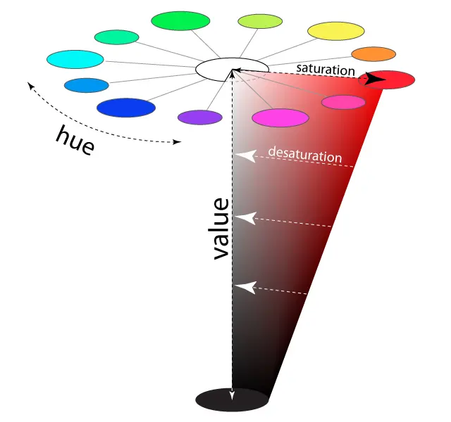
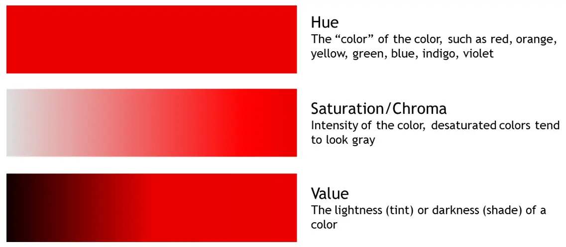
Hue refers to the specific color family—such as red, blue, or yellow—determined by its dominant wavelength of light. Saturation describes the intensity or purity of that color, ranging from a vivid, full-strength pigment to a neutral, washed-out gray. While hue defines what the color is, saturation defines how vibrant it appears.
On this page
What is the difference between hue and saturation?
Hue is the attribute that allows us to classify colors into distinct categories on the visible light spectrum. When you look at a rainbow, the transition from red to orange, yellow, green, blue, indigo, and violet represents changes in hue. Scientifically, this is measured by the dominant wavelength of light reflecting off a surface.
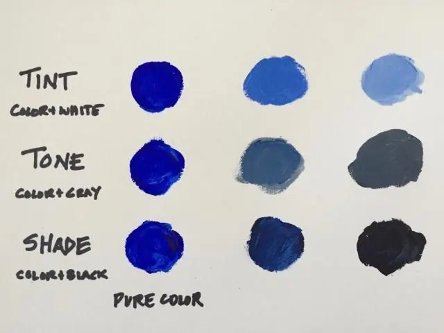
Saturation, often called chroma or intensity, measures how much white, black, or gray is mixed into the hue. A highly saturated color appears bold and vivid, as if it were straight from a tube of paint. A desaturated color looks muted, faded, or closer to a neutral gray tone. Understanding this distinction is fundamental to color theory and digital design.
How do you adjust hue and saturation in design software?
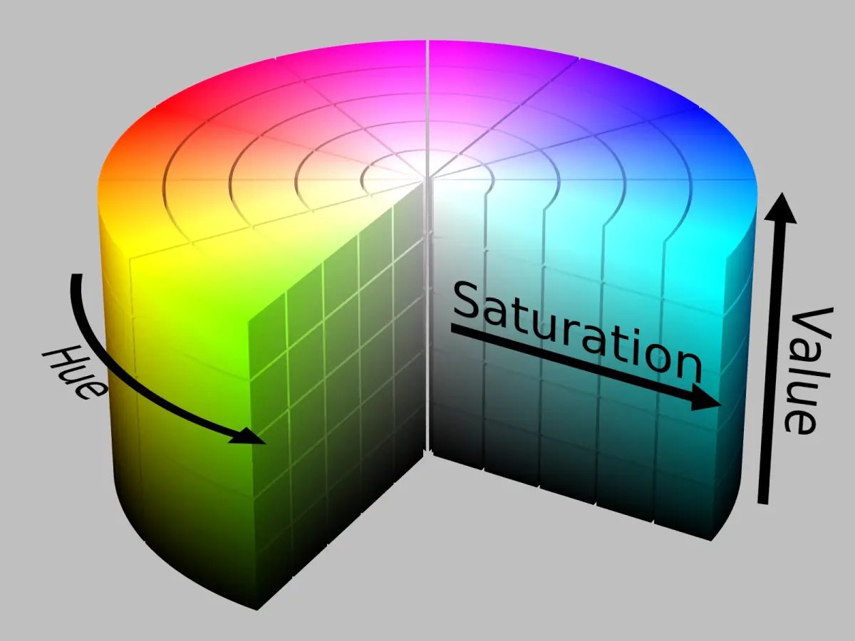
Most professional photo editing and graphic design programs, such as Adobe Photoshop or GIMP, utilize the HSL (Hue, Saturation, Lightness) color model. This system provides granular control over each component, allowing users to manipulate the appearance of an image without altering its fundamental structure.
- Open your image in the editing software and locate the "Adjustments" or "Color" panel.
- Select the "Hue/Saturation" tool to open the adjustment sliders.
- Move the "Hue" slider to shift the entire color spectrum of the selected area.
- Adjust the "Saturation" slider to the right to increase intensity or to the left to decrease it.
- Apply the changes once the desired visual balance is achieved.
Why does saturation affect color perception?
Human eyes perceive color through specialized cells called cones, which are sensitive to different wavelengths of light. When a color is fully saturated, the signals sent to the brain are clear and distinct. As you desaturate a color, the presence of neutral tones confuses these receptors, making the color appear less "loud" or impactful.
This phenomenon is often used in cinematography and photography to establish mood. High saturation is frequently associated with energy, youth, and joy, while low saturation suggests nostalgia, sadness, or a documentary-style realism. By manipulating these levels, creators can influence the emotional response of the viewer without changing the actual objects within the frame.
Common mistakes when editing color
Many beginners struggle with color correction because they over-adjust settings, leading to unnatural results. A frequent error is pushing the saturation slider to the maximum, which causes "clipping." This occurs when the color data becomes so intense that the fine details and textures in the image are lost, resulting in a flat, neon-like appearance.
- Avoid over-saturating skin tones, as this often results in an unnatural, orange, or "sunburned" look.
- Do not shift the hue of an entire image if you only need to correct a specific color cast.
- Be cautious of desaturating too much, as this can make an image look muddy or lifeless rather than artistic.
- Always check your work on a calibrated monitor to ensure the colors you see are accurate to standard color profiles.
Best practices for color harmony
Creating a visually pleasing composition requires a deliberate approach to both hue and saturation. Designers often use the color wheel to select harmonious palettes, such as complementary colors—those opposite each other on the wheel—or analogous colors, which sit side-by-side. These relationships rely on consistent hue selection to maintain a unified theme.
To achieve a professional look, vary the saturation levels within your palette to create a focal point. For example, using a highly saturated accent color against a backdrop of desaturated, neutral tones draws the viewer's eye exactly where you want it. This contrast is a powerful tool in branding, interior design, and fine art. By mastering the balance between the identity of a color and its intensity, you gain complete control over the visual narrative of your work.
Key facts
- Hue refers to the pure color family, such as red, blue, or green, defined by its position on the 360-degree color wheel.
- Saturation measures the intensity or purity of a color, ranging from a neutral gray to a vivid, high-chroma version of that hue.
- You can visualize hue as the "name" of the color and saturation as the "strength" or "vibrancy" of that specific name.
- Decreasing saturation toward zero removes all pigment, resulting in a shade of gray, while increasing it makes the color appear more neon or intense.
- A common mistake is confusing saturation with brightness; brightness controls how much black or white is mixed into the color, not its intensity.
- When editing photos, use the saturation slider sparingly, as pushing it to the maximum often causes "clipping" and loss of detail in digital images.
The bottom line
Hue and saturation are fundamental components of color theory that define how we perceive visual information. Hue identifies the color family, while saturation dictates its intensity and purity. By mastering the distinction between these two properties, you gain better control over design, photography, and digital art. Remember that subtle adjustments to saturation often yield more professional results than relying on the most vivid, high-intensity options available.
People also ask
How does brightness differ from saturation?
Brightness, often called value or lightness, determines how much white or black is added to a color. While saturation changes the intensity of the hue, brightness changes how light or dark the color appears.
What is the HSL color model?
HSL stands for Hue, Saturation, and Lightness, which is a common way computers represent color. It provides a more intuitive way for humans to select colors than the technical Red-Green-Blue (RGB) system.
Can a color have zero saturation?
Yes, a color with zero saturation is technically a grayscale color. It contains no hue information and appears as a shade of black, white, or gray.
Why do my colors look washed out in print?
Colors often look washed out because digital screens use the RGB color space, which supports higher saturation than the CMYK ink process used in printing. Converting to CMYK often forces a reduction in color intensity to fit the printer's gamut.
Is hue the same thing as a pigment?
Hue is the conceptual category of a color, whereas a pigment is the physical substance used to create that color in paint or ink. You can have many different physical pigments that all represent the same hue, such as various types of blue paint.
How do I make a color look more professional?
To achieve a professional look, avoid using fully saturated colors, which can appear harsh or cartoonish. Instead, use slightly desaturated tones to create a more sophisticated and balanced color palette.
This answer was created with the help of AI research tools and reference sources. Spotted an error? Let us know — we correct mistakes quickly. See our editorial policy.