What is a mood board?
Short answer
A mood board is a visual collage used by designers and creatives to define the aesthetic direction of a project. It combines images, textures, color palettes, and typography to communicate a specific style or emotional tone. By organizing these elements, teams can establish a cohesive vision before beginning detailed production work.
On this page
What is the purpose of a mood board?
A mood board serves as a bridge between abstract ideas and concrete design execution. When starting a creative project, it is often difficult to articulate a specific visual style through words alone. By gathering disparate elements into a single space, a mood board helps stakeholders align on the "vibe" of a brand, interior space, or marketing campaign. It acts as a compass, ensuring that everyone involved maintains a consistent aesthetic throughout the development process.
Beyond communication, these boards function as a source of inspiration during creative blocks. Designers often refer back to their boards to ensure that specific color choices or textures remain grounded in the original vision. This practice prevents "design drift," where a project slowly loses its focus due to the addition of conflicting elements. By anchoring the work in a predefined set of visual cues, creators can make faster decisions and maintain a higher level of professional quality.
How do you make a mood board?
Creating a mood board is a structured process that begins with research and ends with curation. You do not need to be a professional designer to build one, as the goal is to capture a feeling rather than a finished product. Follow these steps to build your own:
- Define your core objective by identifying the primary emotion or message you want to convey.
- Gather a wide variety of source material, including photographs, fabric swatches, font samples, and color chips.
- Filter your collection by removing any items that do not fit the established theme.
- Arrange your selected pieces on a canvas, focusing on how different textures and colors interact with one another.
- Refine the layout until the board feels balanced and tells a clear story about the final project.
What tools are used for mood boards?
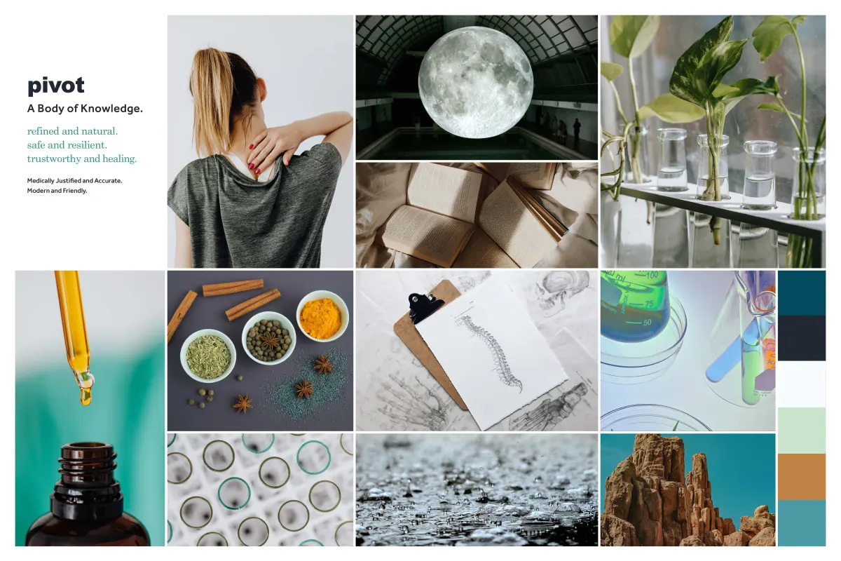
The medium for a mood board depends largely on the project requirements and the creator's personal preference. Digital tools have become increasingly popular due to their flexibility and ease of sharing with remote teams. Platforms like Pinterest, Canva, and Adobe Express allow users to drag and drop images, create color palettes, and adjust layouts in real time. These digital formats are ideal for web design, social media planning, and branding projects where assets are already in a digital format.
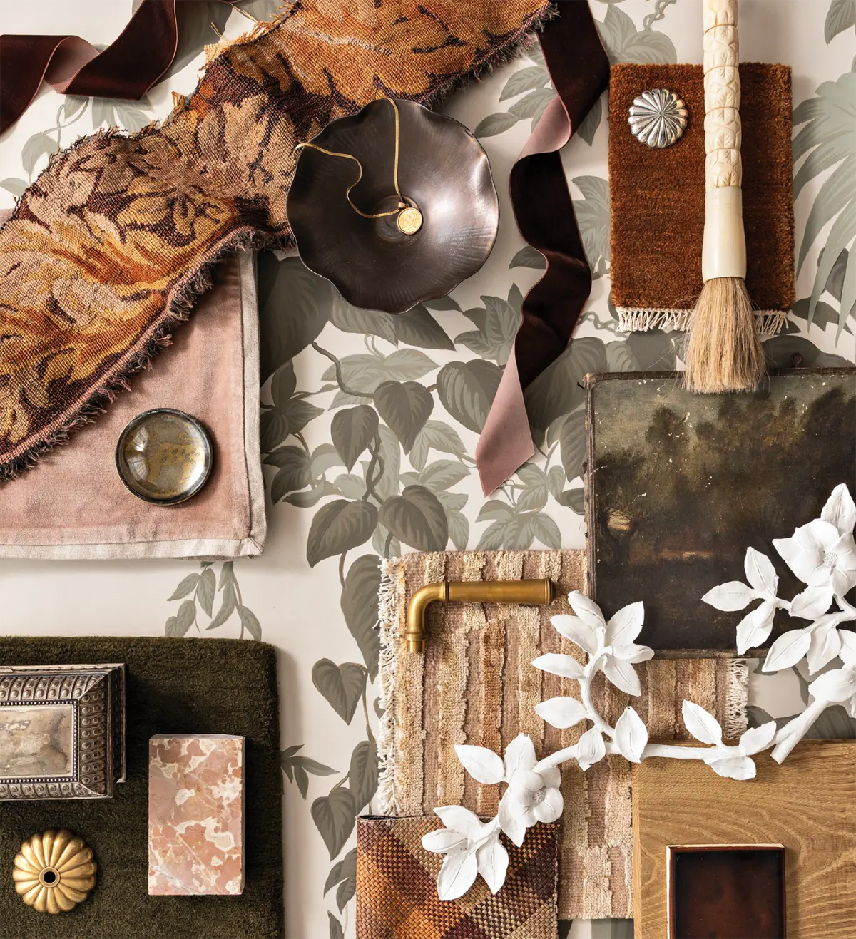
Physical mood boards remain essential for tactile industries such as interior design, fashion, and architecture. Working with physical materials allows designers to experience the weight of a fabric, the sheen of a paint sample, or the texture of a wood grain. Many professionals use a combination of both methods, starting with digital research and transitioning to a physical board to finalize material choices. Regardless of the medium, the effectiveness of the board relies on the quality of the curation rather than the software or materials used.
Common mistakes when making a mood board
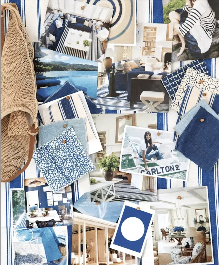
One of the most frequent errors is including too many unrelated images, which results in a cluttered and confusing aesthetic. A mood board should be a focused representation of a specific style, not a collection of everything you like. When a board contains too many competing colors or styles, it loses its ability to guide the project, leaving the team unsure of which direction to pursue. Always prioritize quality over quantity and be willing to cut elements that do not serve the primary goal.
Another significant mistake is failing to consider the practical application of the board. For instance, a mood board for a website must account for screen readability and user interface constraints, while one for a physical room must consider how lighting affects color perception. Ignoring these technical realities can lead to a beautiful board that is impossible to translate into a functional product. Keep the end-use in mind during every stage of the selection process to ensure your vision is actually achievable.
Why mood boards help creative teams
Mood boards are essential for fostering collaboration within diverse teams. By providing a visual reference, they eliminate ambiguity and reduce the risk of misunderstandings between clients and designers. When everyone can see the intended color palette and mood, it becomes much easier to discuss specific changes or improvements. This visual alignment saves significant time by preventing the need for major revisions later in the production cycle.
- They establish a shared vocabulary for discussing complex design elements.
- They help manage client expectations by visualizing the end result early.
- They provide a reference point for third-party vendors, such as printers or contractors.
- They serve as a permanent record of the creative intent behind a project.
By maintaining this shared vision, teams can work more efficiently and produce more cohesive results. The board acts as a constant reminder of the project's identity, ensuring that every detail, from the smallest font choice to the largest layout decision, remains aligned with the overarching strategic goals.
Key facts
- A mood board is a visual collage used to define the aesthetic direction of a project.
- It typically combines textures, color palettes, typography, and reference imagery on a single canvas.
- Professionals use these boards to ensure clients and team members share a unified vision before production begins.
- Digital tools like Pinterest, Canva, and Adobe Express are the most common platforms for modern mood board creation.
- Physical boards often feature tactile swatches, fabric scraps, and magazine clippings to convey sensory depth.
- A successful mood board should focus on a specific "vibe" or emotional response rather than a literal list of items.
The bottom line
A mood board is an essential tool for creative planning, acting as a visual compass that aligns stakeholders on a project’s aesthetic goals. By curating images, colors, and textures, you translate abstract concepts into a concrete reference point. Whether digital or physical, a well-executed board streamlines decision-making, saves time during production, and ensures that the final output remains faithful to your original creative intent.
People also ask
How does a mood board differ from a storyboard?
A mood board focuses on the overarching style, color, and emotional tone of a project. A storyboard is a sequential series of images that outlines the specific narrative flow or plot of a video or animation.
Should I use a physical or digital mood board?
Digital boards are better for collaboration, quick editing, and remote sharing. Physical boards are superior for interior design or fashion projects where texture, lighting, and material quality are essential to the final result.
How many images should be on a mood board?
Aim for 10 to 20 high-quality images that represent the core pillars of your design. Too many images create visual clutter, while too few may fail to communicate the complexity of your intended aesthetic.
Can I include text on my mood board?
Yes, adding a few keywords or specific font samples helps anchor the visual theme. Keep text minimal so it serves as a guide rather than a distraction from the imagery.
When is the best time to create a mood board?
You should create one during the initial discovery phase of a project. It serves as a visual contract between you and your client to prevent misunderstandings later in the development process.
What is the most common mistake when making a mood board?
The most frequent error is including conflicting styles that confuse the final vision. Stick to a cohesive color palette and a consistent level of contrast to ensure the board feels intentional.
This answer was created with the help of AI research tools and reference sources. Spotted an error? Let us know — we correct mistakes quickly. See our editorial policy.