What art style did Piet Mondrian use?
Short answer
Piet Mondrian was a pioneer of De Stijl, an art movement also known as Neoplasticism. His mature style is characterized by a grid of thick black lines, a white background, and the use of only the three primary colors: red, blue, and yellow. This abstract approach sought to represent universal harmony and purity.
On this page
What is the De Stijl art movement?
De Stijl, or "The Style," was a Dutch artistic movement founded in 1917 by Piet Mondrian and Theo van Doesburg. The group advocated for a radical form of abstraction that stripped art of all representational elements, such as landscapes or human figures. By focusing on the fundamental components of painting—lines, shapes, and colors—they aimed to express a spiritual, universal order.
The movement was heavily influenced by the devastation of World War I, as artists sought a new visual language that could bring harmony to a fractured world. They believed that by reducing art to its most basic, objective elements, they could transcend individual emotions and reach a higher, collective truth. This philosophy extended beyond canvas, influencing architecture, furniture design, and typography, all of which prioritized geometric precision and structural clarity.
How to identify a Mondrian painting
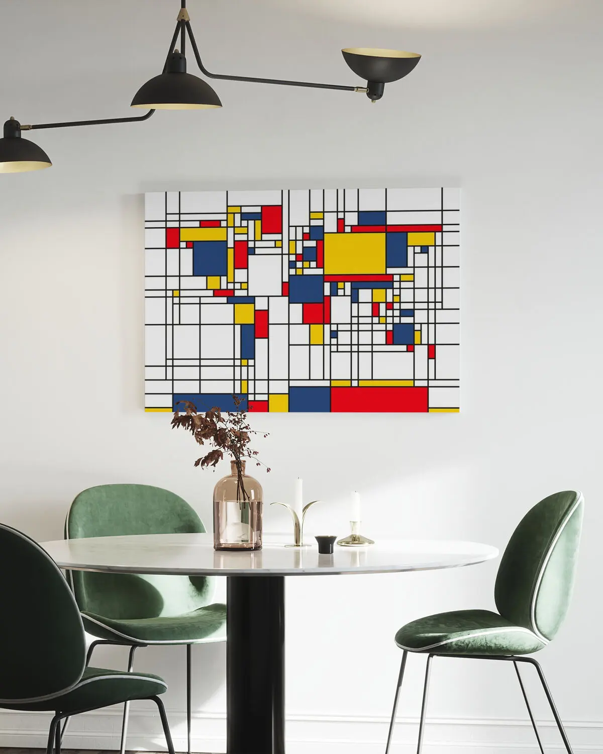
Mondrian’s signature style is instantly recognizable due to its rigid adherence to a specific set of rules. He utilized a strictly orthogonal grid, meaning all lines were either perfectly horizontal or vertical. He never used diagonal lines, as he felt they introduced unnecessary movement and emotion that disrupted the balance of the composition.
To identify a classic work by Mondrian, look for these specific visual characteristics:
- A white or off-white background that acts as a neutral field.
- Thick, black, straight lines that intersect at right angles.
- Rectangular or square color blocks limited to red, blue, and yellow.
- An asymmetrical arrangement that achieves a sense of "dynamic equilibrium."
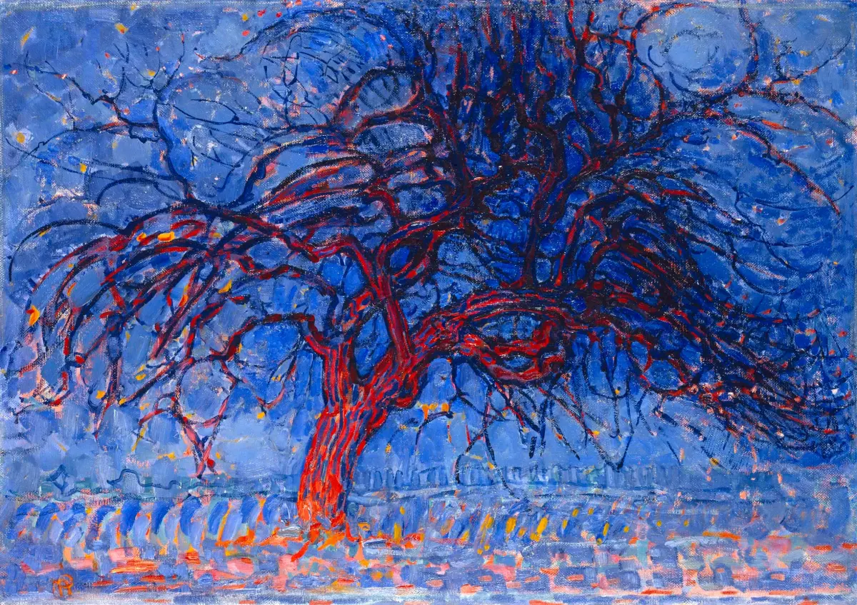
While his early work featured landscapes and trees, his transition to Neoplasticism by the 1920s solidified the iconic look of his later career. If you see a painting with curves, green, or orange, it is not a mature Mondrian work.
Why did Mondrian use primary colors?
Mondrian believed that primary colors were the fundamental building blocks of visual experience. By limiting his palette to red, yellow, and blue, he avoided the complexity and subjective associations of secondary colors like green, purple, or orange. He viewed these three colors as the most pure and direct expressions of nature’s underlying structure.
His use of these colors was not merely aesthetic but deeply philosophical. He wanted to strip away the "particular" to reveal the "universal." By keeping his palette minimal, he ensured that no single color would dominate the viewer's attention, allowing the eye to move across the canvas in a balanced, rhythmic way. This reductionist approach was intended to create a sense of calm and clarity, reflecting his interest in Theosophy, a spiritual movement that emphasized the unity of all things.
How to create art in the style of Mondrian
If you want to experiment with Neoplasticism, you must embrace the discipline of simplicity and precision. The goal is not to express your feelings, but to arrange elements until they reach a state of perfect, static balance.
Follow these steps to create a composition in the style of Mondrian:
- Start with a square or rectangular canvas and a black marker or tape.
- Draw a series of horizontal and vertical lines that extend to the edges of the frame.
- Vary the thickness of these lines or the size of the resulting rectangles to create visual interest.
- Fill a few of the shapes with flat, solid red, blue, or yellow paint.
- Leave the majority of the shapes white or off-white to maintain the necessary negative space.
Be careful not to over-complicate the grid. The power of the style lies in the tension between the few colored shapes and the empty white space.
Common mistakes when painting abstract grids
One of the most frequent mistakes beginners make is creating a symmetrical grid. Mondrian’s work is famously asymmetrical; he carefully balanced the "weight" of his colored blocks against the empty white rectangles to achieve harmony. A perfectly symmetrical grid feels static and boring, whereas an asymmetrical one feels alive and balanced.
Another common error is using too much color. If you fill every rectangle with paint, the painting loses its sense of light and airiness. The white space is just as important as the colored blocks, as it serves as the "respiratory system" of the composition. Finally, avoid using messy or textured brushstrokes. Mondrian’s style requires clean, flat, and precise application of paint to emphasize the intellectual nature of the work. By keeping the surface smooth and the edges sharp, you honor the movement’s commitment to clarity and the removal of the artist's personal, emotional gesture.
Key facts
- Piet Mondrian is the primary founder of De Stijl, an art movement advocating for pure abstraction and universality.
- His signature style, known as Neoplasticism, relies exclusively on vertical and horizontal lines.
- He limited his color palette to the three primary colors: red, blue, and yellow.
- He used white, black, and gray as "non-colors" to provide structure and balance to his compositions.
- To emulate his style, use a grid system to divide your canvas into asymmetrical rectangles of varying sizes.
- A common mistake is using diagonal lines or mixed colors; true Neoplasticism requires strict perpendicularity and primary hues.
The bottom line
Piet Mondrian’s Neoplasticism represents a radical departure from traditional representational art. By restricting his work to a grid of black lines and primary colors, he sought to capture the underlying order of the universe. His legacy proves that simplicity and structure can convey profound meaning. Whether you are studying art history or designing a space, his disciplined approach remains a masterclass in visual balance and harmony.
People also ask
Did Mondrian always paint in this abstract style?
No, Mondrian began his career as a landscape painter. He transitioned through Impressionist and Cubist phases before arriving at his signature geometric abstraction in the early 1920s.
Why did Mondrian choose to use only primary colors?
He believed that primary colors were the most fundamental elements of visual language. By stripping away secondary colors and complex textures, he aimed to reach a universal harmony that transcended individual emotion.
How did Mondrian create his precise black lines?
He typically painted his black lines using oil paint applied with a brush. He often adjusted the thickness of these lines to create a sense of depth and tension within the composition.
What was the philosophy behind De Stijl?
The movement sought to achieve a "new plastic art" that reflected the order of the universe. Members believed that art should be objective, rational, and stripped of all decorative or representational elements.
Are Mondrian’s paintings considered minimalist?
While they share characteristics with Minimalism, they belong to the earlier movement of Geometric Abstraction. His work focuses on spiritual balance and mathematical precision rather than the industrial materials often associated with later Minimalism.
Can I use Mondrian’s style in interior design?
Yes, the style is frequently applied to furniture, textiles, and architecture. To achieve this look, focus on clean lines, white backgrounds, and strategic pops of primary colors to create a balanced, modern aesthetic.
This answer was created with the help of AI research tools and reference sources. Spotted an error? Let us know — we correct mistakes quickly. See our editorial policy.