How do you shade rocks?
Short answer
Shading rocks requires identifying a single light source to create consistent highlights and shadows. Use a gradient of tones, moving from deep, saturated shadows in crevices to bright highlights on protruding edges. Layering values—from dark to light—builds depth, while texture-specific strokes mimic the rugged, uneven surfaces characteristic of natural stone.
On this page
How to identify light sources on rocks
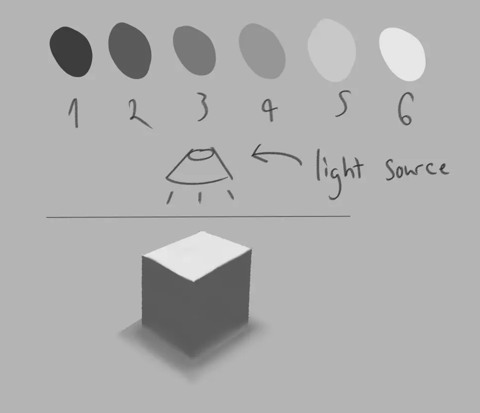
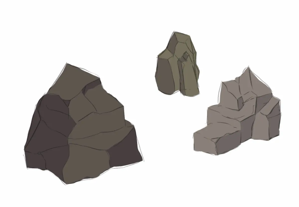
Before applying any pigment or graphite, you must establish where the light originates. Rocks are geometric forms with multiple facets, meaning every plane will react differently to illumination. If your light source is top-left, the top-left faces of the rock will be the lightest, while the bottom-right faces will fall into shadow. Consistency is the most important factor in making a rock look three-dimensional rather than flat.
To map your light, follow these steps:
- Draw a small arrow in the corner of your workspace pointing toward the rock to remind yourself of the light direction.
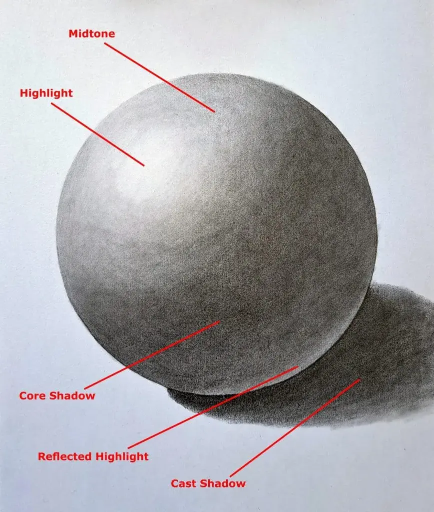
- Identify the "core shadow," which is the darkest area on the rock itself, usually located just past the transition from light to dark.
- Determine if you need a "cast shadow," which is the dark shape the rock projects onto the ground behind it.
- Keep the cast shadow darker and sharper than the shadows on the rock’s surface to ground the object firmly in space.
Best shading techniques for beginners
Beginners often make the mistake of using a single gray tone for the entire rock. Instead, think of a rock as a collection of planes that catch light at different angles. Use a hatching or cross-hatching technique to build up layers of graphite or paint. By varying the pressure of your pencil or the opacity of your brush, you can create a smooth gradient that mimics the subtle shifts in color found in granite, limestone, or slate.
When shading, focus on these three distinct areas of value:
- Highlights: The areas where light hits directly, often left as the white of the paper or a very light tint.
- Midtones: The true color or base value of the rock, covering the majority of the surface.
- Shadows: The deepest, darkest areas, usually found in cracks, crevices, or the underside of protrusions.
Always start with the midtones and gradually work toward the darkest shadows to avoid making the rock look muddy or overly dark too early in the process.
How to add texture to shaded rocks
Rocks are rarely smooth; they are defined by pits, cracks, and mossy patches. Once you have established your basic light and shadow, use "stippling"—a series of small dots—or irregular, jagged lines to suggest texture. Focus these marks along the transition line between light and shadow, as this is where the rock’s surface irregularities become most visible to the human eye. Avoid making these textures too uniform, as nature is inherently chaotic and asymmetrical.
If you are drawing a porous rock, such as volcanic pumice, use tiny circles and irregular clusters of dark dots to represent air bubbles. For layered rocks like shale, use long, parallel strokes that follow the contours of the stone. Always ensure that your texture marks follow the perspective of the rock's planes. If a crack runs across a flat face, the line should be straight; if it wraps around a corner, the line must bend to maintain the illusion of volume.
Common mistakes when shading rocks
The most frequent error is neglecting the "reflected light" that bounces off the ground and hits the underside of the rock. Without this, a rock often looks like a floating, dark blob rather than a solid object. A small, lighter band of value at the very bottom of the shadow side adds a sense of realism and weight. Another common mistake is using outlines that are too heavy, which flattens the form and makes it look like a cartoon.
Avoid these common pitfalls to improve your results:
- Over-blending: Using a blending stump too aggressively can turn a rugged rock into a smooth, plastic-like sphere.
- Uniform shadows: Shadows should vary in intensity; they are deepest in narrow crevices and lighter as the surface curves away from the light.
- Ignoring the ground: A rock sitting on a surface must interact with that surface through a cast shadow that anchors it in place.
- Using too much contrast: Unless the rock is under direct, harsh sunlight, keep your shadows soft and your highlights subtle to maintain a natural look.
How to use contrast to create depth
Contrast is the primary tool for defining the distance and sharpness of a rock's edges. A rock that is closer to the viewer should have higher contrast between its lightest highlight and its darkest shadow. As rocks recede into the background, the contrast should decrease, and the edges should become softer. This technique, known as atmospheric perspective, prevents your drawing from looking like a flat collage and gives the scene a sense of vast, natural space.
To master this, try squinting at your subject to blur the details; this allows you to see the overall value structure without getting distracted by small textures. If you see only two main values—light and dark—you are on the right track. Use your darkest pencil or paint only in the most protected cracks, and keep your highlights reserved for the sharpest, most prominent edges. By carefully managing the range of values, you can make a simple sketch of a rock appear heavy, hard, and physically present on the page.
Key facts
- Identify your light source first to ensure all shadows fall consistently in the same direction.
- Use a "core shadow" on the rock's surface where the light is blocked, followed by a softer "reflected light" area.
- Apply darker values to the crevices and cracks to create depth and emphasize the rock's rugged texture.
- Avoid using pure black for shadows; instead, mix your base color with a complementary color or blue to create richer, cooler tones.
- Use a "cast shadow" on the ground that is darkest near the base of the rock and lightens as it moves away.
- Keep your edges sharp where the rock form changes abruptly and soft where the surface curves gently.
The bottom line
Shading rocks effectively requires a keen understanding of how light interacts with irregular, hard surfaces. By establishing a consistent light source, utilizing a full range of values, and carefully defining both core and cast shadows, you can transform simple shapes into realistic, three-dimensional stone textures. Remember to prioritize sharp edges and textural variety over excessive blending to capture the rugged, enduring nature of the subject matter.
People also ask
What is the difference between a core shadow and a cast shadow?
A core shadow exists on the rock itself, marking the transition from light to dark on the object's form. A cast shadow is the shape projected by the rock onto the surrounding ground or nearby surfaces.
Should I use a blending stump to smooth out my shading?
While blending stumps can smooth transitions, avoid over-blending, which can make rocks look like soft plastic. Use hatching or cross-hatching to maintain the gritty, hard texture characteristic of stone.
How do I make a rock look wet in a drawing?
To depict wet rocks, increase the contrast significantly by adding sharp, bright white highlights and very deep, dark shadows. The reflections will be much clearer and more distorted than on a dry surface.
Why does my rock look flat despite my shading?
Flatness usually occurs when the mid-tones are missing or the transition between light and dark is too abrupt. Ensure you have a full range of values, including a clear highlight, mid-tone, core shadow, and reflected light.
How do I shade complex rock formations like cliffs?
Break the cliff into smaller geometric planes and shade each plane individually based on its angle to the light. Focus on the deep fissures between these planes to define the overall structure.
What pencils or tools work best for shading rocks?
Use a variety of graphite pencils, such as 2H for light initial sketching and 4B or 6B for deep, dark shadows. A kneaded eraser is essential for lifting highlights and cleaning up edges.
This answer was created with the help of AI research tools and reference sources. Spotted an error? Let us know — we correct mistakes quickly. See our editorial policy.