How do you shade in Procreate?
Short answer
Shading in Procreate is achieved by layering colors, adjusting brush opacity, and using blending modes. You can create depth by applying darker tones on new layers set to Multiply, or by using the Smudge tool to soften transitions. Mastering these digital techniques allows for realistic lighting, volume, and texture in your artwork.

On this page
How to shade using layers
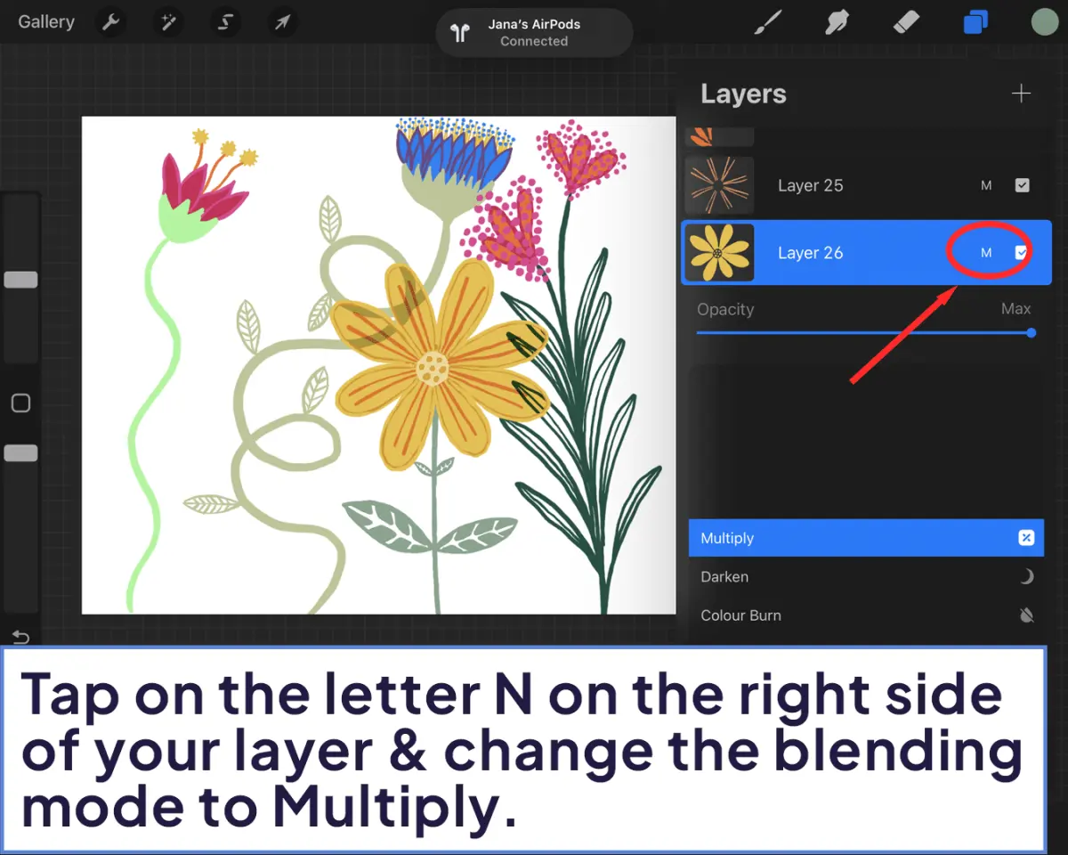
Layering is the foundation of professional digital painting in Procreate. Instead of shading directly on your base color, create a new layer above it and tap the "N" icon to change the layer's blending mode to Multiply. This mode darkens the colors beneath it, making it ideal for creating shadows that look natural and cohesive. You should also use Clipping Masks to ensure your shading stays within the boundaries of your base shape.
To set up a clipping mask, follow these steps:
- Create a new layer directly above your base color layer.
- Tap the layer thumbnail to open the Layer Options menu.
- Select "Clipping Mask" from the list.
- Paint your shadows; the strokes will only appear where there is content on the layer below.
This method allows you to experiment with different shadow colors without risking damage to your original line art or base colors.
Best brushes for shading
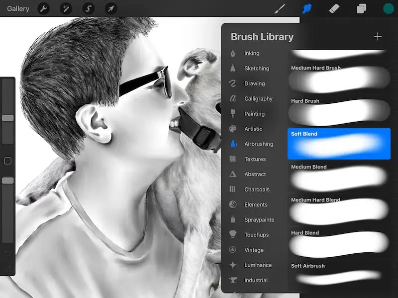
Procreate offers a vast library of brushes, but specific categories are better suited for shading depending on your desired style. The Airbrushing set is excellent for smooth, soft gradients, while the Painting set provides textured brushes that mimic traditional media like oil or gouache. For beginners, the Soft Brush in the Airbrushing folder is the most versatile tool for building up subtle volume on spheres or skin tones.
When choosing a brush, consider the pressure sensitivity of your Apple Pencil. You can customize any brush by tapping it to open the Brush Studio. Under the "Apple Pencil" settings, you can adjust the pressure-to-opacity or pressure-to-size sliders to gain more control over how dark your shading strokes appear. Experimenting with these settings helps you achieve a more organic, hand-drawn look rather than a flat, digital appearance.
How to blend shadows smoothly
Blending is essential for transitioning from light to dark areas without harsh, distracting lines. Procreate provides three primary ways to blend: the Smudge tool, the Eraser tool, and manual color mixing. The Smudge tool is the most direct method; it pushes existing pixels around the canvas, effectively blurring the edge between your highlight and shadow colors.
To blend effectively, try these techniques:
- Use a soft-edged brush with low opacity to gently paint over the transition area between two colors.
- Select the Smudge tool with a textured brush to create a painterly, blended effect that retains some grit.
- Use the Gaussian Blur effect under the Adjustments menu to soften an entire layer of shadows instantly.
Avoid over-blending, as this can lead to a "muddy" appearance where colors lose their vibrancy and definition, making the artwork look flat and uninteresting.
Common mistakes when shading
One of the most frequent errors is using pure black for shadows. In reality, shadows are rarely neutral black; they usually contain cool tones like deep blues, purples, or desaturated greens. Using black often makes an image look dirty or lifeless. Instead, pick a dark, saturated color from the color wheel that complements your light source, such as a deep violet for a warm, sunny scene.
Another common mistake is neglecting the "core shadow" and "reflected light." A shadow is not just a single dark patch; it has a gradient of intensity. The area closest to the light source is the highlight, followed by the midtones, the core shadow, and finally a small amount of reflected light on the edge of the object. Ignoring these components makes objects appear like two-dimensional stickers rather than three-dimensional forms with real volume and weight.
How to improve shading speed
Efficiency in Procreate comes from utilizing gestures and quick menus. You can quickly pick a color from your canvas by holding your finger down on any area, which triggers the Eyedropper tool. This is vital for shading because it allows you to sample your base color and then shift it slightly toward a darker, cooler hue on the color wheel without opening the menu repeatedly.
You can also speed up your workflow by using these shortcuts:
- Two-finger tap to undo a mistake, and three-finger tap to redo.
- Three-finger swipe down to access the Copy and Paste menu for quick layer duplication.
- Use the "Selection" tool to isolate specific areas, preventing you from accidentally shading outside of the intended zones.
By practicing these shortcuts, you reduce the time spent navigating menus, allowing you to focus entirely on the artistic process of rendering light and shadow.
Key facts
- Use the Clipping Mask feature to shade on a new layer without affecting the base colors on the layer below.
- Utilize the Alpha Lock function by swiping right with two fingers on a layer to restrict painting to existing pixels.
- Adjust the "Opacity" slider in the Layers panel to soften or intensify your shading effects.
- Select the "Multiply" blend mode for a layer to create natural-looking shadows by darkening the colors underneath.
- Choose a soft airbrush from the "Airbrushing" brush set to create smooth, realistic gradients for shadows.
- Use the "Gaussian Blur" tool under the Adjustments menu to instantly soften hard-edged shadows for a professional finish.
The bottom line
Mastering shading in Procreate requires a combination of layer management and color theory. By utilizing features like Clipping Masks and Multiply blend modes, you can build depth efficiently without damaging your original work. Always remember to avoid using pure black for shadows, as shifting your hue toward cooler tones creates a more realistic and professional appearance that adds significant dimension to your digital illustrations.
People also ask
What is the difference between Multiply and Overlay blend modes for shading?
Multiply mode darkens the base colors, making it ideal for standard shadows, while Overlay increases contrast and saturation, which is better for dramatic lighting effects.
How do I keep my shadows from looking muddy?
Avoid using pure black for shadows; instead, pick a dark, cool-toned color like deep blue or purple to maintain vibrancy in your artwork.
Can I shade using the same brush I use for line art?
You can, but using a brush with pressure sensitivity or a soft texture often yields more professional results when building depth and volume.
What is the best way to shade skin tones?
Use a warm, desaturated orange or red for shadows on skin to keep the complexion looking natural rather than gray or sickly.
How do I fix shading that went outside the lines?
Use the Eraser tool to clean up edges or use a Clipping Mask to ensure your brush strokes are confined strictly to the shape of the object.
Should I shade on the same layer as my base colors?
It is generally better to shade on a separate layer so you can adjust, erase, or change the opacity of your shadows without ruining your base work.
This answer was created with the help of AI research tools and reference sources. Spotted an error? Let us know — we correct mistakes quickly. See our editorial policy.