How do you shade digitally?
Short answer
Digital shading involves applying varying tones and colors to a base layer to create the illusion of three-dimensional form. By manipulating light sources, opacity, and blending modes, artists define volume and depth. Mastering this technique requires understanding light physics, utilizing layer masks, and practicing consistent brush pressure to achieve smooth, professional transitions.
On this page
How to shade digitally for beginners
To begin shading, establish a clear light source before applying any color. Imagine a single point where light originates, such as a lamp or the sun, and ensure all shadows fall consistently in the opposite direction. Create a new layer set to "Multiply" mode above your base colors; this allows you to darken areas without losing the underlying hue. Use a soft-edged brush for subtle gradients and a hard-edged brush for crisp, defined shadows.
When starting out, keep your palette simple to avoid muddy colors. Select a slightly cooler, more saturated tone for your shadows rather than simply using black or gray. Black often desaturates a piece, making it appear flat and lifeless. Instead, shift your color wheel toward blue or purple to create natural-looking depth. Practice by rendering basic geometric shapes like spheres and cubes to understand how light wraps around different surfaces.
What tools are best for digital shading
Most professional digital artists rely on pressure-sensitive tablets to control the opacity and flow of their strokes. Software such as Adobe Photoshop, Clip Studio Paint, or Procreate offers specialized brush engines that mimic traditional media like charcoal or oil paint. These tools allow for "pen pressure" settings, which modulate the thickness and transparency of your marks based on how hard you press the stylus against the tablet surface.
Beyond hardware, utilizing layer blending modes is essential for efficient workflows. These mathematical settings change how pixels on one layer interact with the layers beneath them. Consider these common modes:
- Multiply: Darkens the image, ideal for standard shadows.
- Overlay: Increases contrast and saturation, useful for adding rim light.
- Screen: Lightens the image, perfect for highlights and glows.
- Soft Light: Provides a subtle adjustment to color and value.
How to create smooth gradients
Achieving smooth transitions between light and shadow is a hallmark of high-quality digital art. Avoid the "airbrush trap," where an artist uses a soft brush for everything, resulting in a blurry, amateurish look. Instead, use a hard-edged brush to block in your shadow shapes, then use a smudge tool or a low-opacity brush to blend the edges selectively. This keeps the form looking solid while maintaining a professional finish.
To master the transition, follow these steps:
- Block in your primary shadow shape with a solid, opaque brush.
- Select a mid-tone color that sits between your base color and your shadow color.
- Use a soft brush with low opacity to gently paint along the edge where the light meets the shadow.
- Add a "terminator line," the darkest part of the shadow, to emphasize the turn of the form.
- Use a small, hard brush to add reflected light inside the shadow area to add realism.
Why shading looks muddy or flat
Muddy shading often occurs when artists pick colors that are too close in value or desaturated. If your shadows look like gray smudges, check your color picker; you are likely choosing colors from the center of the color wheel. For vibrant, professional results, move your selection toward the corners of the color picker to maintain saturation. Additionally, avoid using the same shadow color for every object in the scene, as light bounces off surrounding surfaces, tinting shadows with local colors.
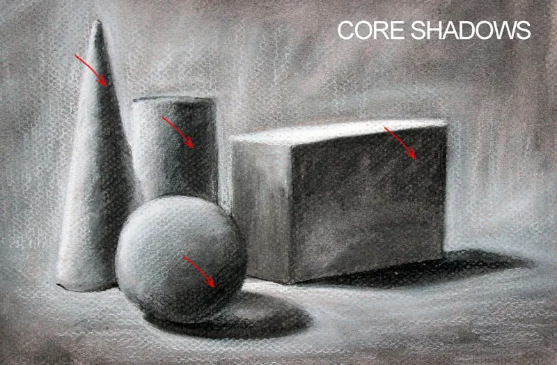
Flatness usually results from a lack of contrast between light and dark values. If your image lacks impact, try increasing the range between your highlights and your core shadows. Squinting at your reference or your canvas can help you see the overall value structure rather than getting distracted by details. If the image still feels flat, ensure that you are defining the "core shadow," which is the darkest point on the object itself, rather than just relying on soft gradients.
Common mistakes when shading digitally
One of the most frequent errors is over-rendering, where an artist spends too much time on tiny details before establishing the overall form. This leads to an unbalanced piece where the lighting feels inconsistent across the canvas. Always work from large shapes to small details, ensuring the big picture makes sense before refining individual textures. Another mistake is ignoring cast shadows; objects do not exist in a vacuum and must interact with the ground or nearby surfaces to feel grounded.
To improve your shading efficiency, avoid these common pitfalls:
- Using pure black for shadows, which kills color vibrancy.
- Relying on the "Undo" button too much instead of practicing confident strokes.
- Forgetting to create a new layer for shadows, making future edits impossible.
- Neglecting reflected light, which makes objects look like plastic rather than realistic materials.
- Using a single brush size for the entire rendering process, which creates a monotonous visual texture.
By focusing on these fundamental principles, you will develop the technical discipline necessary to produce sophisticated, three-dimensional digital artwork that commands attention from the viewer.
Key facts
- Use a separate layer for shadows to avoid altering your base colors permanently.
- Set your shadow layer to "Multiply" mode to ensure colors darken realistically rather than turning gray.
- Pick a cool color, like a desaturated blue or purple, for shadows instead of using pure black.
- Establish a single, consistent light source to determine where highlights and shadows should fall.
- Use a soft brush for diffused shadows and a hard-edged brush for sharp, cast shadows.
- Adjust the layer opacity to control the intensity of your shading based on the environment's brightness.
The bottom line
Digital shading relies on understanding light physics and utilizing software-specific tools like blending modes and layers. By consistently defining a light source and choosing appropriate shadow colors, you can transform flat shapes into three-dimensional forms. Practice varying your brush hardness and opacity to create depth, and always prioritize color harmony over using black. Mastering these fundamental techniques will significantly improve the realism and impact of your artwork.
People also ask
Should I use black for shading?
Avoid using pure black for shadows, as it often makes colors look muddy or flat. Instead, choose a darker, cooler version of your base color to maintain color harmony.
What is the difference between soft and hard shadows?
Hard shadows occur when an object is close to a surface or the light source is intense and direct. Soft shadows appear when light is diffused, such as on a cloudy day or when the light source is large.
How do I know where to place shadows?
Imagine a line from your light source to your object to determine the direction of the light. Shadows will always fall on the side of the object opposite the light source.
What is "cell shading"?
Cell shading is a technique that uses distinct, hard-edged shadows without gradients. It is commonly used in animation and comic book styles to create a bold, graphic look.
How can I make shadows look more professional?
Add "ambient occlusion," which are the tiny, dark shadows in crevices where two objects meet. These small details provide depth and prevent your subject from looking like it is floating.
How do I shade skin tones effectively?
Use warmer tones for shadows on skin rather than cool colors. Adding a touch of red or orange to your shadow color helps maintain the natural, healthy appearance of human flesh.
This answer was created with the help of AI research tools and reference sources. Spotted an error? Let us know — we correct mistakes quickly. See our editorial policy.
![How to Use a Clipping Mask in Procreate: What Does It Do and How Does It Work? [VIDEO]](/img/b3/how-do-you-use-clipping-masks-in-procreate-1.webp)