What is hand lettering?
Short answer
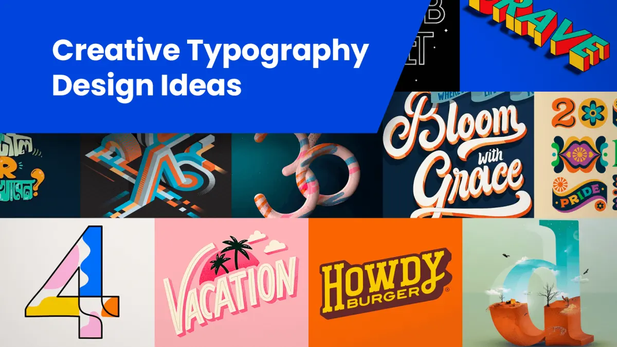
Hand lettering is the art of drawing individual letters as unique illustrations rather than writing them with a continuous stroke. Unlike calligraphy, which relies on repetitive pen movements to create traditional scripts, hand lettering treats each character as a custom graphic design element. It is a deliberate, constructive process focused on composition and style.
On this page
What is the difference between lettering, calligraphy, and typography?
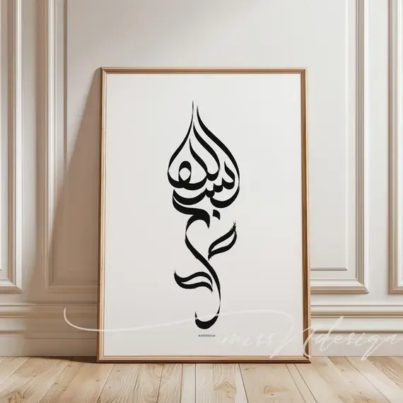
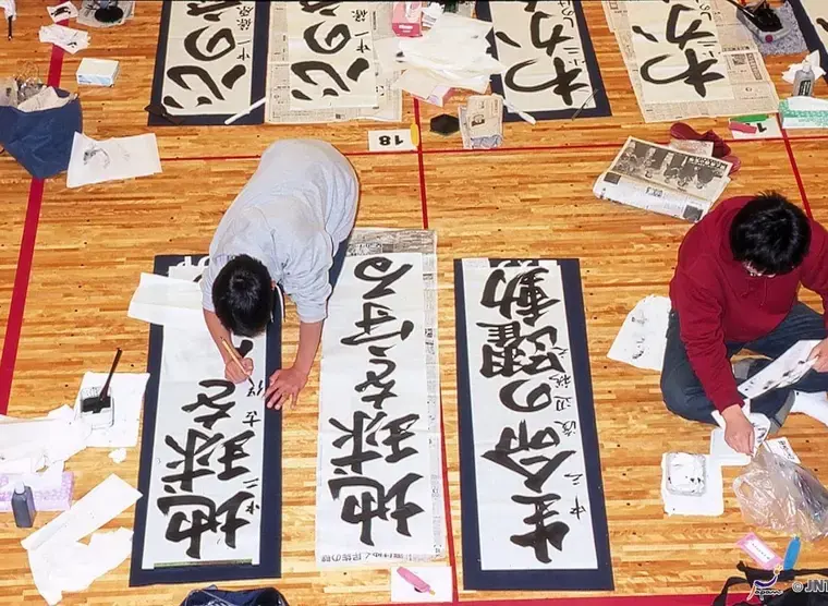
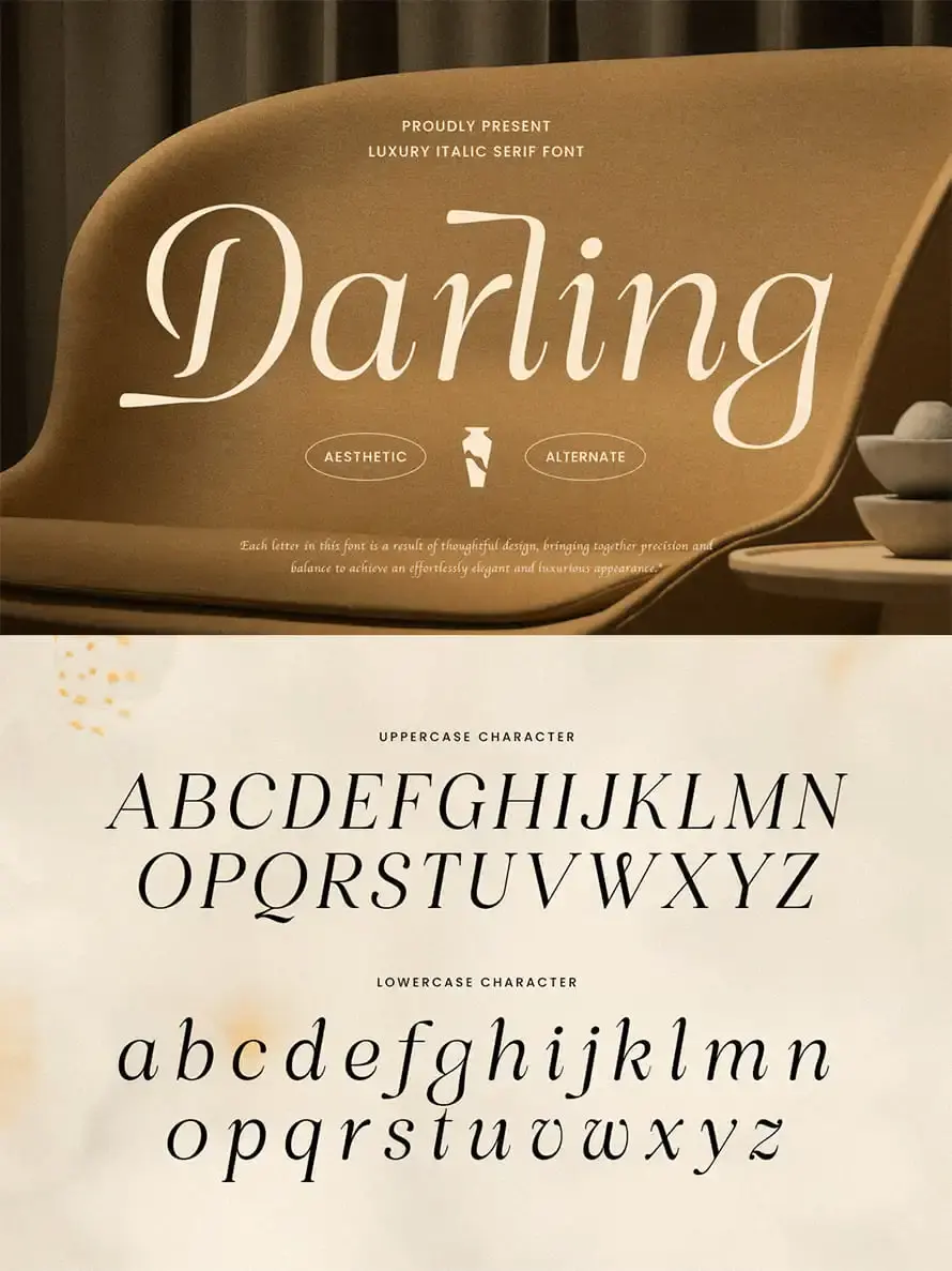
Many people confuse these three disciplines, but they function differently. Typography involves using pre-existing sets of characters, or fonts, designed to be used repeatedly in various layouts. Calligraphy is the art of beautiful writing, characterized by the rhythm and pressure of a single stroke, often following historical scripts like Copperplate or Uncial.
Hand lettering is distinct because it is essentially drawing. You are not writing; you are constructing letterforms through sketching, refining, and filling in shapes. While a calligrapher creates a letter in one motion, a letterer might spend hours outlining, shading, and perfecting a single character. Understanding this distinction is essential for choosing the right tools and approach for your creative project.
How to get started with hand lettering for beginners
You do not need expensive equipment to begin your journey. Start with basic supplies like a pencil, an eraser, a ruler, and high-quality smooth paper. Once you are comfortable with the construction of letters, you can experiment with specialized pens, such as fine liners for outlining or brush pens for adding variable thickness.
Follow these steps to complete your first lettering piece:
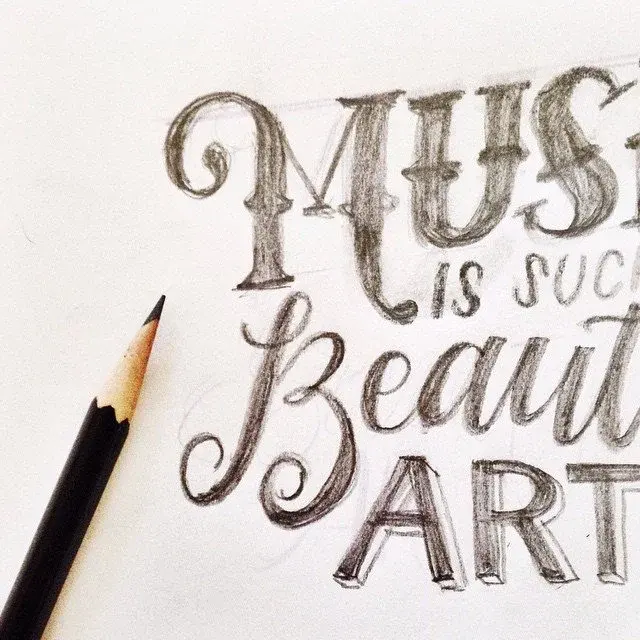
- Sketch a rough layout of your word or phrase to determine the composition.
- Draw light guidelines to ensure your letters stay consistent in height and alignment.
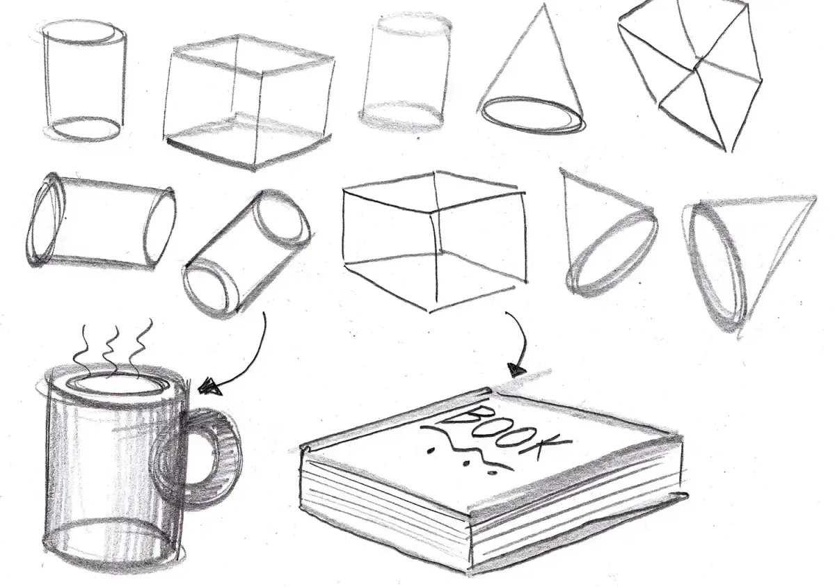
- Block out the basic shapes of the letters using simple geometric forms.
- Refine the shapes by adding weight, serifs, or decorative elements.
- Ink over your pencil lines and erase the construction marks once the ink is dry.
What are the essential techniques for better lettering?
Mastering hand lettering requires an understanding of anatomy and balance. Every letter consists of specific parts, such as the stem, the bowl, and the crossbar. By adjusting the weight of these parts, you can create different visual styles, ranging from bold, blocky letters to elegant, flowing scripts.
Consistency is the most important factor in professional-looking results. To achieve this, focus on these core elements:
- Kerning: The process of adjusting the space between individual letters to ensure they look balanced.
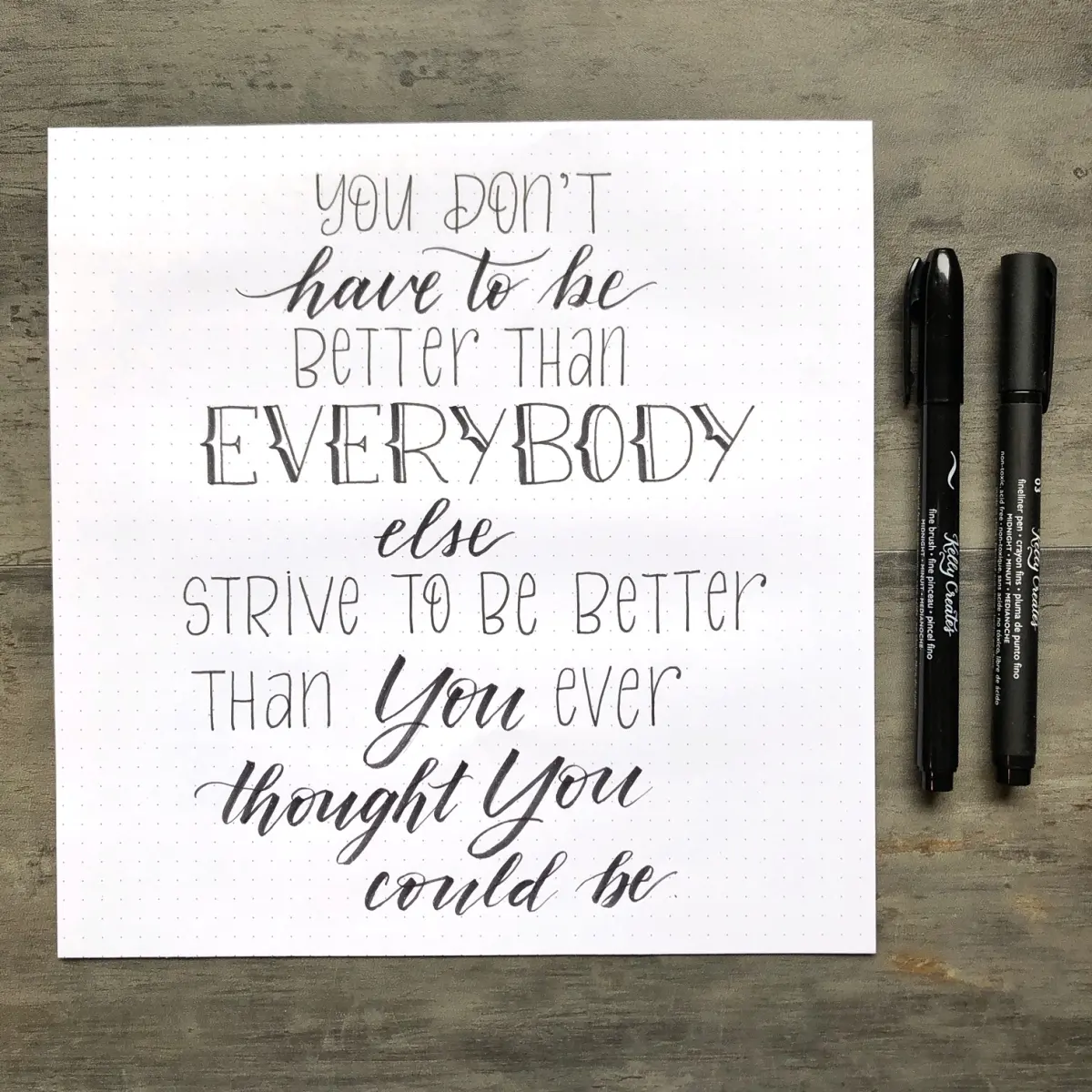
- Hierarchy: Using size, weight, and style to emphasize specific words in a phrase.
- Flourishing: Adding decorative swirls or lines to extend the character's personality without sacrificing legibility.
- Contrast: Balancing thick and thin lines to create visual interest within the letterforms.
Common mistakes when learning hand lettering
Even experienced artists encounter hurdles, but beginners often fall into predictable traps. One of the most frequent errors is neglecting the importance of guidelines. Without them, letters tend to drift, resulting in a sloppy, unprofessional composition that lacks structural integrity. Always take the time to measure your baselines and x-heights before putting pencil to paper.
Another common mistake is rushing the process. Hand lettering is inherently slow; it is a methodical practice of building shapes. Trying to force a letter to look perfect on the first try often leads to frustration. Instead, focus on the "sketch-refine-ink" workflow. If a letter looks awkward, do not hesitate to erase it and redraw it. Remember that the beauty of hand lettering lies in the intentionality of every stroke and the patience required to execute it correctly.
How to improve your hand lettering skills over time
Developing a unique style takes time and consistent practice. Start by analyzing existing lettering styles you admire, such as vintage signage, movie posters, or book covers. Copying these styles helps you understand how different artists handle spacing, color, and texture. Eventually, you will begin to synthesize these influences into your own aesthetic.
To continue your growth, consider these strategies:
- Daily drills: Spend 15 minutes a day practicing basic shapes like ovals and parallel lines to build muscle memory.
- Study typography: Learn the rules of classic typefaces to understand why certain proportions look pleasing to the eye.
- Experiment with mediums: Move beyond paper and try lettering on chalkboards, glass, or digital tablets.
- Seek feedback: Share your work with fellow artists to gain new perspectives on your composition and technique.
By consistently applying these methods, you will notice your control over the pen improves, allowing you to create complex and expressive lettering designs with confidence and precision.
Key facts
- Hand lettering is the art of drawing letters as individual illustrations rather than writing them like cursive or printing.
- Unlike calligraphy, which relies on specific pen strokes and rhythm, lettering focuses on the construction and composition of letterforms.
- Essential tools for beginners include graphite pencils, erasers, fine-liner pens, and heavy-weight paper or grid pads.
- A common practice is to establish a "skeleton" of the letter first, then build the weight and decorative elements around that structure.
- Professional hand letterers often use tracing paper to iterate and refine their designs before finalizing them with ink.
- Consistency in baseline, slant, and letter spacing is the primary factor that distinguishes amateur work from professional-grade lettering.
The bottom line
Hand lettering is a deliberate design process that transforms letters into unique visual art. By treating every character as a custom illustration rather than a simple writing task, you can create expressive and balanced compositions. With basic tools, a focus on structural consistency, and consistent practice, you can master this craft to enhance everything from personal journals to professional branding projects with a distinct, human-made aesthetic.
People also ask
What is the difference between hand lettering and calligraphy?
Calligraphy is the art of "writing" letters using specific tools like broad-edged pens to create thick and thin strokes in one motion. Hand lettering is the art of "drawing" letters, where you build the forms manually and can refine or correct them as you go.
Do I need to have good handwriting to learn hand lettering?
No, you do not need perfect natural handwriting to excel at hand lettering. Because you are drawing each letter as an individual shape, you can use guides and rulers to ensure accuracy regardless of your standard penmanship.
What are the most common mistakes for beginners?
The most frequent error is neglecting to sketch a light pencil layout before using ink. Beginners also often struggle with inconsistent spacing between letters, which can make a design look cluttered or unbalanced.
Can I use digital tablets for hand lettering?
Yes, many artists use tablets and specialized software to practice lettering. Digital tools allow for infinite layers and easy corrections, which is helpful for learning how to structure complex letterforms without wasting paper.
How long does it take to become proficient?
Proficiency depends on consistent daily practice, but most beginners see significant improvement within three to six months of regular study. Focusing on one specific style, such as serif or script, can accelerate your technical growth.
Is hand lettering still relevant in a digital age?
Hand lettering remains highly relevant in branding, logo design, and custom stationery. Its unique, human touch provides a sense of authenticity and craftsmanship that standardized digital fonts often lack in marketing and personal projects.
This answer was created with the help of AI research tools and reference sources. Spotted an error? Let us know — we correct mistakes quickly. See our editorial policy.