How do you start calligraphy?
Short answer
Start calligraphy by selecting a specific script, such as Copperplate or Gothic, and acquiring essential tools like a nib, holder, ink, and practice paper. Master basic strokes before attempting full letters. Consistent daily practice, proper posture, and patience are the fundamental requirements for developing muscle memory and professional-grade lettering skills.
On this page
What tools do I need to start calligraphy?
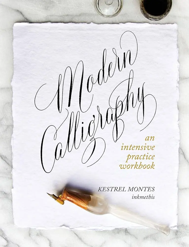
To begin, you do not need an expensive kit, but you do need specialized equipment that differs from standard writing pens. For pointed-pen calligraphy, you require a nib, a pen holder, ink, and high-quality paper. The nib is the metal tip that splits to create thick and thin lines, while the holder provides the grip. Beginners often start with a "straight" holder, though "oblique" holders are standard for scripts like Copperplate because they help maintain the correct angle.
Paper choice is critical because standard printer paper causes ink to "bleed" or feather, which ruins clean lines. Look for smooth, bleed-proof paper such as Rhodia pads or HP Premium 32lb laser paper. For ink, a simple bottle of Higgins Eternal or sumi ink is ideal for practice. These inks flow consistently and are forgiving for those just learning to control the pressure of the nib.
- A flexible pointed nib (e.g., Nikko G).
- A pen holder (straight or oblique).
- A bottle of non-waterproof black ink.
- Smooth, bleed-proof practice paper.
- A microfiber cloth for cleaning nibs.
How do I practice basic calligraphy strokes?
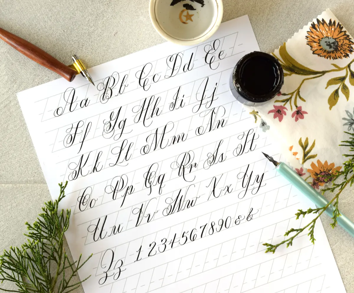
Calligraphy is not about drawing letters; it is about building them through repetitive, controlled strokes. Before attempting the alphabet, you must master the fundamental shapes that compose every letter. These include the entrance stroke, the underturn, the overturn, the compound curve, the oval, and the ascending and descending loops. By isolating these shapes, you develop the muscle memory necessary for consistent letter formation.
Focus on the pressure you apply to the nib. Pressing down creates a thick "downstroke," while lifting the pressure creates a thin "upstroke." This contrast is the hallmark of elegant calligraphy. Spend your first few weeks filling pages with these basic strokes rather than rushing into words. If your strokes look shaky, slow down your pace. Consistency in the height and slant of these strokes is more important than the speed at which you write.
- The Entrance Stroke: A light, upward diagonal line.
- The Underturn: A thick downstroke transitioning into a light upstroke.
- The Overturn: A light upstroke transitioning into a thick downstroke.
- The Oval: A circular shape starting at the top, curving left, and closing.
- The Compound Curve: A combination of an overturn and an underturn.
How long does it take to learn calligraphy?
Learning calligraphy is a gradual process that depends on your dedication and the complexity of the script you choose. Most beginners can learn the basic alphabet of a foundational script within one to three months of consistent, daily practice. However, achieving professional-level consistency, flourish control, and speed usually takes several years of deliberate study. It is a craft that rewards patience, as your hand must physically adapt to the demands of the tools.
Do not be discouraged if your work looks messy during the first few weeks. Calligraphy requires fine motor skills that most people have not developed through standard handwriting. Aim for 15 to 30 minutes of practice each day rather than one long, exhausting session once a week. This frequency helps your brain and muscles retain the movements. Tracking your progress by dating your practice sheets will show you how much your line quality improves over time.
Common mistakes when starting calligraphy
One of the most frequent mistakes is using too much pressure on the upstroke, which causes the nib to catch on the paper and splatter ink. Beginners often try to move too quickly, leading to uneven spacing and shaky lines. Another common error is failing to clean the nib properly. If ink dries on the nib, it becomes clogged and will no longer produce smooth, consistent lines. Always wipe your nib with a damp cloth after each practice session.
Additionally, many novices ignore the importance of the "slant." Most traditional scripts require letters to be tilted at a consistent angle, usually 55 degrees. If your letters lean in different directions, the word will look disorganized regardless of how well the individual letters are formed. Using a slant guide sheet underneath your paper is an essential trick to ensure your letters remain uniform. Never guess the angle; always use a printed guide until your eye is trained.
Best resources for calligraphy beginners
The internet offers a wealth of free and paid resources to guide your journey. Websites such as The Postman’s Knock provide excellent tutorials, printables, and troubleshooting guides for various scripts. YouTube is also a valuable tool for watching how experts hold their pens and manage their ink flow. Seeing the movement in real-time helps clarify concepts that are difficult to explain through text alone, such as the exact angle of the wrist.
Joining a local or online calligraphy guild can also provide community support and constructive feedback. These organizations often host workshops where you can receive personalized instruction. Books like "The Speedball Textbook," first published in 1915, remain the gold standard for learning traditional lettering styles. By combining these resources with a structured practice routine, you will establish a solid foundation in the art of beautiful writing. Dedication to these fundamentals ensures your progress remains steady as you refine your personal style.
Key facts
- Calligraphy is the art of decorative lettering, historically performed with dip pens, brushes, or quills.
- The term originates from the Greek words "kallos" (beauty) and "graphe" (writing).
- Beginners should start with a monoline pen or a felt-tip calligraphy marker to learn basic stroke pressure.
- Proper posture and a 45-degree paper angle are essential for maintaining consistent letter slant.
- The "Copperplate" script is a classic style that relies on varying the pressure of the pen nib.
- Always clean your metal nibs immediately after use to prevent dried ink from clogging the reservoir.
The bottom line
Starting calligraphy is a rewarding journey that requires patience, proper tools, and consistent practice. By focusing on fundamental strokes rather than entire words, you build the necessary muscle memory to create elegant, uniform lettering. Avoid the common mistake of rushing; instead, prioritize steady, fluid movements. With the right guidance and a commitment to daily drills, you will soon master the balance between precision and artistic expression.
People also ask
What is the difference between calligraphy and hand lettering?
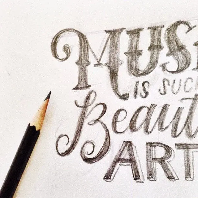
Calligraphy is the art of writing letters using a specific tool with varying pressure, while hand lettering is the art of drawing letters as individual illustrations. Calligraphy is performed in a single stroke, whereas lettering is often built up through multiple strokes and corrections.
Do I need expensive equipment to start?
No, you can begin with a simple felt-tip chisel marker and inexpensive grid paper. Once you master basic strokes, you can invest in professional-grade oblique pen holders, metal nibs, and high-quality fountain pen inks.
How long does it take to learn calligraphy?
Most beginners can learn the basic alphabet in a few weeks of consistent daily practice. Achieving professional-level consistency and speed, however, often requires years of dedicated study and muscle memory development.
Is it better to learn calligraphy left-handed?
Left-handed writers often face challenges with ink smearing and nib dragging, but it is entirely possible to master the craft. Many left-handed calligraphers use an oblique pen holder or adjust their paper angle to achieve the same results as right-handed counterparts.
What kind of paper works best for calligraphy?
You should use smooth, high-quality paper that prevents ink from "feathering" or spreading into the fibers. Rhodia or Clairefontaine pads are popular choices because their coated surfaces allow for crisp, clean lines.
Why do my letters look shaky?
Shaky lines are usually a result of tension in the hand or moving the pen too slowly. Try to engage your whole arm rather than just your fingers, as larger muscle groups provide more stability and smoother transitions.
This answer was created with the help of AI research tools and reference sources. Spotted an error? Let us know — we correct mistakes quickly. See our editorial policy.
![Brush Calligraphy Letters [A-to-Z Analysis + Free Printables]](/img/f6/what-is-brush-lettering-1.webp)