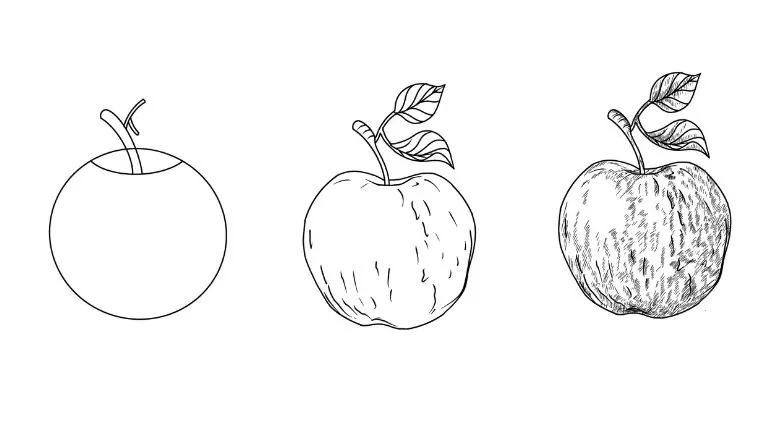
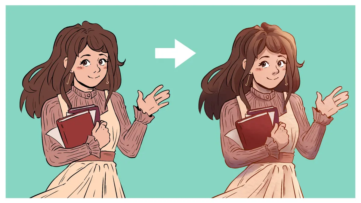
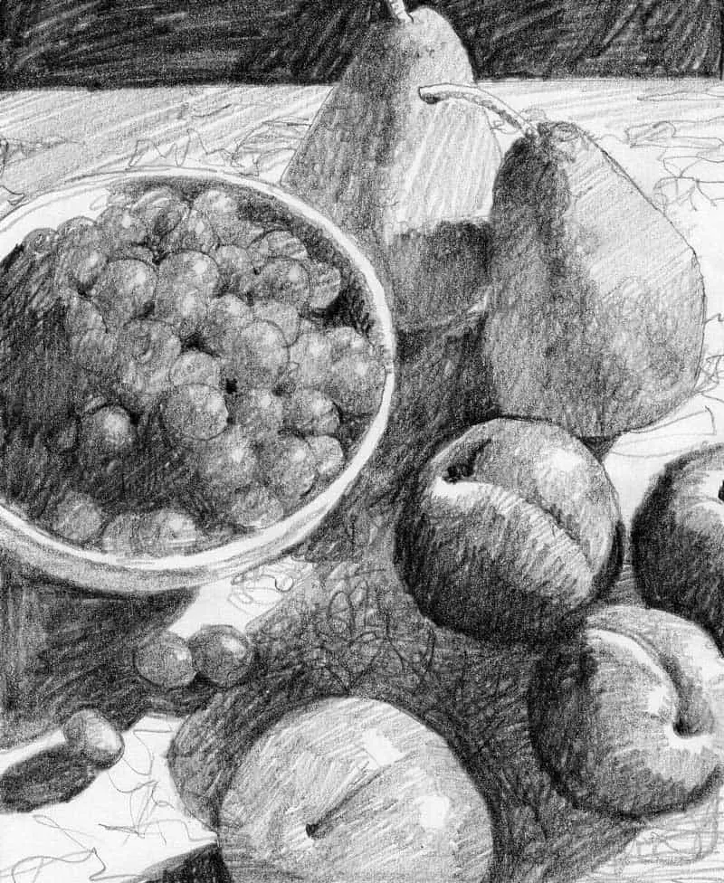
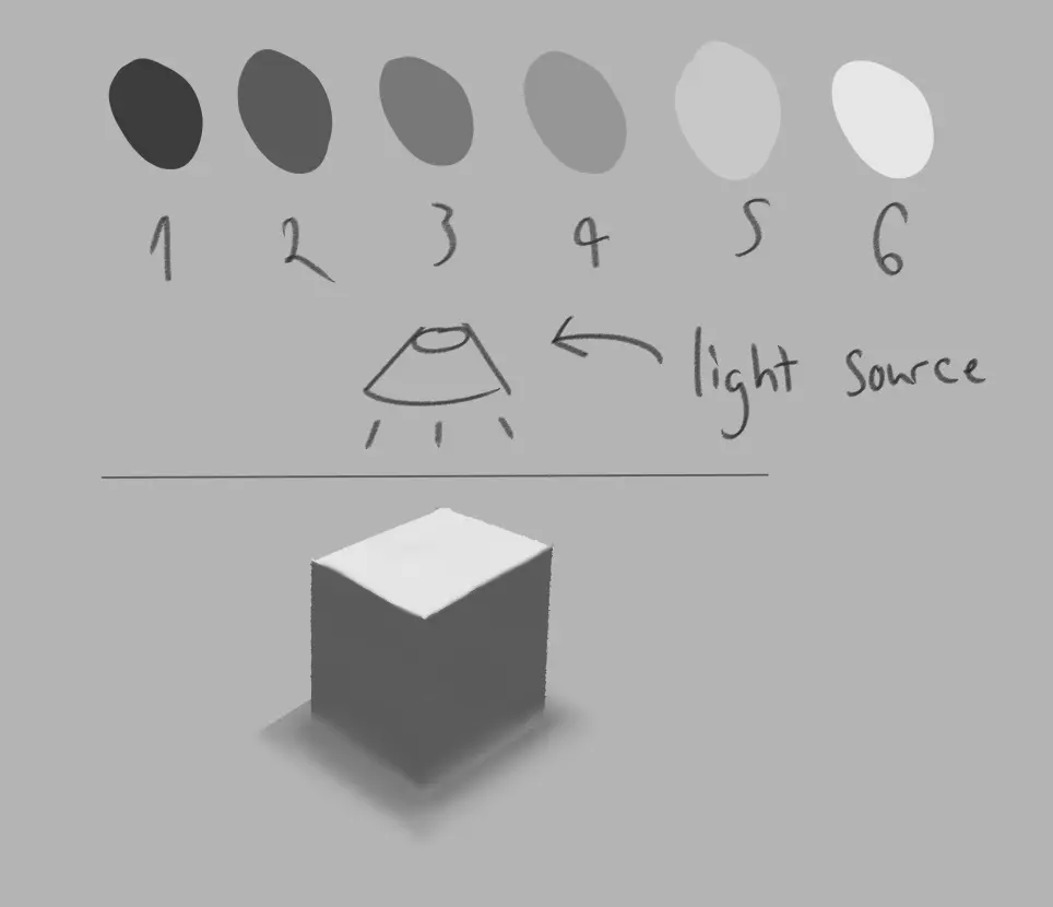
How do you shade a drapery?
Short answer
Shading drapery requires identifying the light source to establish consistent highlights and shadows. By layering graphite or paint, you define the folds, using deep tones in the recessed areas and lighter values on the protruding crests. Consistent pressure and smooth transitions are essential to create the illusion of three-dimensional fabric volume.
On this page
How to identify light sources for drapery
Before applying any marks to your canvas or paper, you must determine exactly where the light originates. A single, consistent light source is the foundation of realistic shading, as it dictates where the highlights, mid-tones, and core shadows will fall across the fabric. If your light comes from the upper left, every fold must follow that logic, with the brightest areas facing that direction and the deepest shadows tucked into the opposite recesses.
To map your drapery effectively, follow these steps:
- Squint at your subject to simplify the complex folds into basic shapes of light and dark.
- Lightly sketch the "terminator line," which is the boundary where light transitions into shadow on the fabric surface.
- Mark the deepest points of the folds, as these areas will receive the least amount of reflected light.
- Identify the "cast shadows," which occur where one fold of fabric overlaps and blocks light from hitting another section.
Best shading techniques for beginners
For those new to rendering fabric, starting with a medium-grade pencil, such as an HB or 2B, allows for easier blending and correction. Begin by applying a light, uniform layer of graphite across the entire area that is in shadow. Gradually build up the darkness by applying additional layers rather than pressing harder, which can damage the paper's tooth and make blending difficult.
Using a blending stump or a soft cloth helps create the smooth, flowing transitions characteristic of soft textiles. Avoid using your fingers to blend, as the natural oils on your skin can create uneven patches that resist further graphite application. Focus on the "core shadow," which is the darkest part of the fold, and let the value gently lighten as it moves toward the reflected light at the edge of the fabric.
Why drapery shading looks flat
The most common reason drapery appears flat is a lack of contrast between the highlights and the deepest shadows. Fabric is rarely a single flat color; it is a complex landscape of varying values. If your drawing lacks a true black or a crisp, white highlight, the fabric will appear stiff and lifeless rather than soft and voluminous.
Another factor is the failure to account for reflected light. Even in the deepest shadow of a fold, there is usually a small amount of light bouncing off the floor or surrounding surfaces back onto the fabric. By adding a subtle, lighter value at the very edge of a dark fold, you create a sense of roundness that makes the fabric look three-dimensional. Without this reflected light, the drapery will look like a solid, carved object rather than flexible material.
Common mistakes when shading folds
Beginners often focus too much on drawing every single wrinkle, which leads to a cluttered and confusing image. Instead of outlining every fold, focus on the major shapes and how they relate to the overall form of the object underneath the fabric. Over-detailing small wrinkles early in the process often results in a drawing that lacks a clear sense of structure and weight.
Avoid these frequent errors to improve your results:
- Using a single, uniform stroke that ignores the curvature of the fabric.
- Neglecting to vary the pressure of your pencil, which leads to a flat, one-dimensional appearance.
- Creating harsh, sharp edges on every fold, which makes the fabric look like metal or plastic instead of soft cloth.
- Ignoring the "cast shadow" shape, which must follow the contours of the surface it falls upon.
How to add texture and depth to fabric
Once you have established the base values, you can add final details to suggest the specific texture of the fabric. Silk, for example, requires sharp, high-contrast transitions between light and dark to mimic its reflective surface. Conversely, heavy wool or denim requires softer, more gradual shading with less intense highlights, reflecting the way these materials absorb light rather than bouncing it off.
Use an eraser to pull out highlights after your shading is complete, which can add a crispness that is difficult to achieve by drawing around the light. By carefully observing how the fabric hangs and where it pulls against its support, you can add small, strategic lines that indicate tension. These final touches, when combined with a solid foundation of light and shadow, transform a simple sketch into a convincing representation of draped material that feels heavy, soft, and physically present within your composition.
Key facts
- Identify your light source first, as all shadows must consistently fall away from it to create a realistic three-dimensional effect.
- Use a range of graphite pencils, such as 2H for light initial outlines and 4B or 6B for deep, dark crevices.
- Drapery folds are defined by "core shadows," which are the darkest areas located just inside the edge of a fold.
- Leave the brightest areas, known as highlights, completely white or very lightly shaded to represent where light hits the fabric directly.
- Use a blending stump or a soft cloth to smooth out transitions between light and dark, avoiding harsh lines unless the fabric is very stiff.
- Cast shadows, which occur where one fold of fabric blocks light from hitting another, are typically sharper and darker than soft, rounded shadows.
The bottom line
Shading drapery effectively requires a keen eye for the interplay between light and form. By establishing a consistent light source and focusing on the relationship between highlights, core shadows, and reflected light, you can transform simple lines into realistic, flowing fabric. Remember to use a variety of pencil grades and avoid over-blending, as maintaining distinct edges is essential for capturing the texture and weight of the material.
People also ask
How do I determine where the darkest shadows should be placed?
Darkest shadows, or core shadows, occur on the side of a fold that is turned furthest away from the light source. Observe the "turn" of the fabric and place your darkest marks at the point where the surface begins to curve away from the light.
Should I use a smudge tool or my finger to blend graphite?
It is best to use a paper blending stump rather than your finger. Fingers contain natural oils that can create uneven, muddy spots on the paper and make future layers of graphite difficult to apply.
How do I make fabric look like silk instead of denim?
Silk requires high contrast, featuring very sharp, bright highlights and deep, sudden shadows. Denim or wool is better represented by softer, more gradual transitions and less intense highlights.
What is the most common mistake when shading fabric?
Many beginners create shadows that are too uniform in tone. Drapery is rarely one flat color; it requires subtle variations in pressure to show the complex way light bounces off different angles of the cloth.
How do I keep my drawing from looking flat?
To avoid a flat appearance, ensure you are including reflected light in your shadows. Even in a dark fold, a small amount of light often bounces back from the floor or nearby objects, which adds depth.
Is it better to shade the whole piece at once or focus on one fold?
It is better to work across the entire drawing in stages. By building up the values of the whole composition simultaneously, you ensure that the contrast remains balanced and consistent throughout the entire piece.
This answer was created with the help of AI research tools and reference sources. Spotted an error? Let us know — we correct mistakes quickly. See our editorial policy.