How do you shade a cartoon?
Short answer
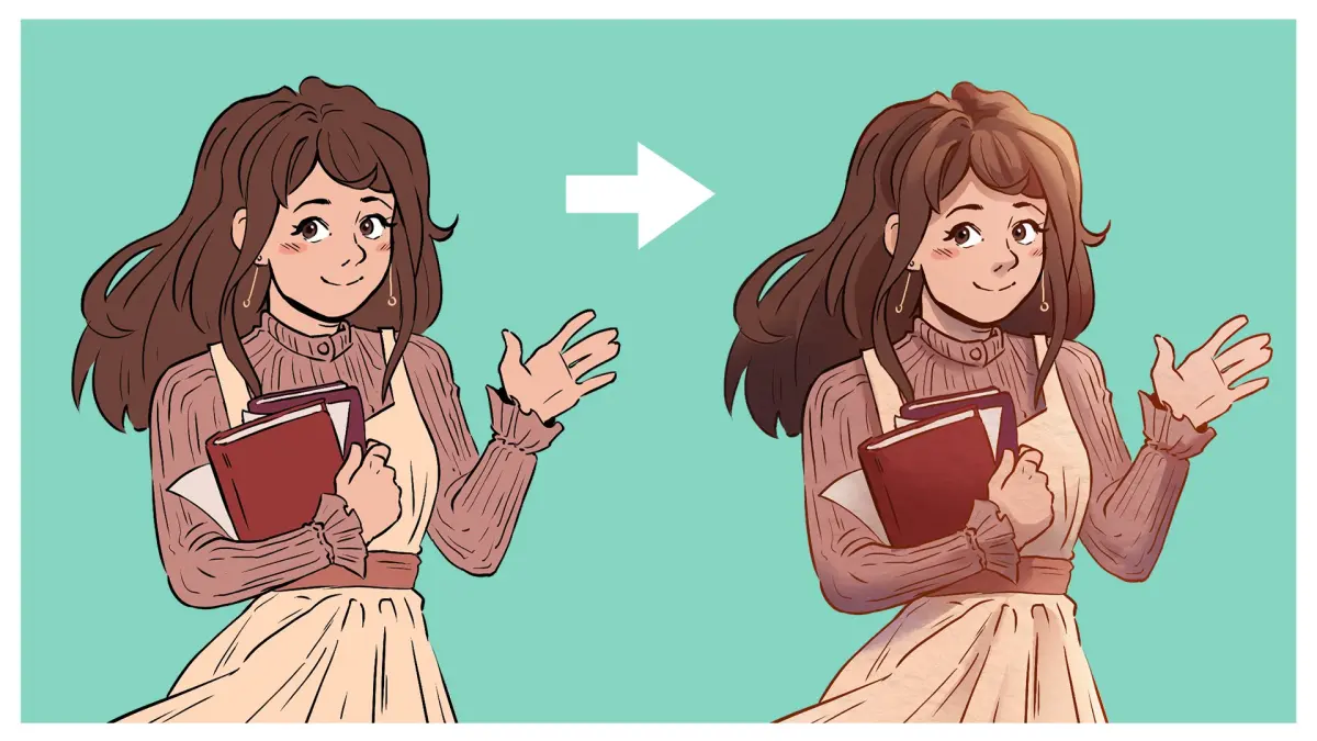
Shading a cartoon involves defining a consistent light source and applying shadows to create volume and depth. You must identify where light hits an object and where it is blocked, then use flat colors or gradients to represent these areas, ensuring your shadow shapes remain simple and consistent across the entire character.
On this page
How to determine a light source
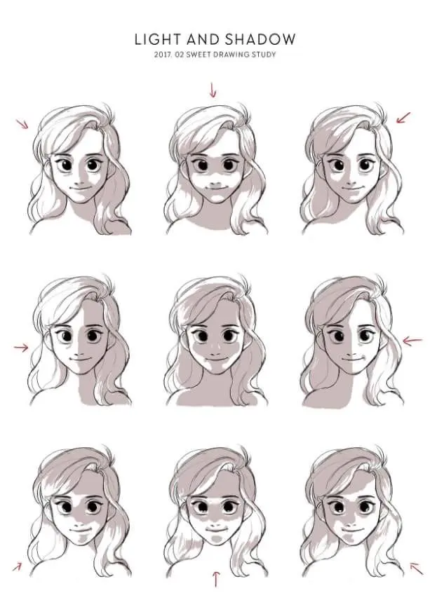
Before applying any color, you must decide where your light is coming from. If the light is positioned at the top right, every shadow on your character must fall toward the bottom left. This consistency is the most important rule in cartooning because it grounds the character in a three-dimensional space. Without a clear light source, your drawing will look flat and confusing to the viewer.
To practice this, imagine a small sun icon in the corner of your canvas. Draw a simple sphere and map out where the light hits it directly, where the mid-tones exist, and where the core shadow sits. Once you master this on a sphere, apply the same logic to the complex shapes of a cartoon body.
- Place a dot on your canvas to represent the light source.
- Draw lines from the light source to the edges of your character.
- Identify the "terminator line," which is the boundary between the light and shadow.
- Keep the light source fixed for the entire scene to maintain visual unity.
How to choose shadow colors
Many beginners make the mistake of simply using black to shade their cartoons. Using pure black often makes a drawing look muddy or "dirty," especially when applied over bright colors. Instead, professional artists use a technique called "color shifting." This involves moving your color selection toward a cooler or warmer hue while simultaneously darkening the value. For example, if you are shading a yellow shirt, do not just make the yellow darker; move your brush toward an orange or a desaturated purple.
This approach creates vibrant, professional-looking shadows that feel integrated with the base colors. You can experiment with different color palettes to set the mood of your cartoon. Cool shadows (blues and purples) often suggest moonlight or a somber atmosphere, while warm shadows (oranges and reds) suggest sunset or indoor lighting. Always test your shadow colors on a separate layer to ensure they harmonize with your base palette before committing to the final render.
Best tools for shading cartoons
The tools you use depend on the style of the cartoon you are creating. For classic, "cel-shaded" cartoons—like those seen in 1990s television animation—you want a hard-edged brush. This style relies on clean, distinct shapes of shadow that do not blend into the base color. It is efficient, readable, and iconic. Conversely, if you want a softer, more painterly look, you should use a brush with a soft edge or a blending tool to create smooth transitions between light and shadow.
- Hard-edged brushes: Best for bold, graphic styles and quick production.
- Soft-edged brushes: Ideal for creating organic, rounded forms and realistic lighting.
- Lasso tool: Essential for selecting specific areas to shade without going outside the lines.
- Clipping masks: Highly recommended for keeping your shadows contained within the base color layer.
- Layer blending modes: Use "Multiply" mode for shadows, as it naturally darkens the base color while maintaining its hue.
Common mistakes when shading cartoons
The most frequent error is "pillow shading," which occurs when an artist shades only the outer edges of an object. This makes the subject look like a deflated balloon rather than a solid, three-dimensional form. To avoid this, treat your character as a collection of simple geometric shapes like cylinders and cubes. Shadows should follow the contours of these shapes, wrapping around the limbs and torso rather than just tracing the outline of the character.
Another common mistake is making shadows too small or too faint. If your shadows are too thin, they will disappear when the image is viewed on a small screen or printed. Do not be afraid to make your shadow shapes large and bold. If you are unsure about the placement, squint your eyes while looking at your drawing; the shadows should remain visible even when the details blur. If they vanish, your contrast is likely too low and needs to be pushed further.
How to add highlights and reflected light
Shading is not just about the dark areas; it is also about the light. Highlights are the brightest points on an object, usually occurring where the light source hits the surface most directly. Adding a small, crisp highlight on the nose, eyes, or shoulders can make a cartoon character pop off the page. Be careful not to overuse these; too many highlights will make the character look like they are made of wet plastic or chrome.
Reflected light is the secret weapon of professional illustrators. This is the faint light that bounces off the ground or nearby objects and hits the shadow side of your character. By adding a thin line of lighter color along the edge of a shadow, you create a sense of bounce and atmosphere.
- Identify the core shadow on the character.
- Add a thin, desaturated highlight along the bottom edge of that shadow.
- Ensure the reflected light is never as bright as the primary light source.
- Use this technique to separate the character from the background, creating a professional finish that adds depth to any cartoon.
Key facts
- Determine a single, consistent light source before drawing any shadows to ensure the lighting remains logical.
- Use "cel shading" for a classic animation look, which utilizes sharp, distinct edges between light and shadow.
- Apply "soft shading" with gradients or airbrushing to create a sense of volume and realistic depth on rounded surfaces.
- Select shadow colors by shifting the base hue toward the cool end of the color wheel, such as adding blue or purple.
- Avoid using pure black for shadows, as it often makes the image look muddy or flat; use dark, desaturated tones instead.
- Maintain a consistent shadow density throughout the entire piece to keep the visual style unified.
The bottom line
Shading is essential for transforming flat drawings into three-dimensional characters. By establishing a clear light source and using consistent, cool-toned shadows, you create depth and visual interest. Whether you prefer the sharp look of cel shading or the smooth transitions of soft gradients, the key is to avoid using black and to follow the object's form. Practice these techniques to bring your cartoon figures to life.
People also ask
Should I use black to darken my colors for shading?
You should avoid using black because it desaturates colors and makes them look dull. Instead, mix your base color with a darker, cooler hue to maintain vibrancy while creating depth.
What is the difference between core shadow and cast shadow?
A core shadow is the darkest area on the object itself, while a cast shadow is the projection of that object onto a nearby surface. Understanding this distinction helps ground your character in a physical space.
How do I choose the right color for shadows?
A common professional technique is to pick a color that is darker and slightly more saturated than the base color. For example, if your base is a warm yellow, use a cool orange or light purple for the shadow.
Can I use multiple light sources in one cartoon?
You can use multiple lights, but it increases complexity significantly. Beginners should master single-source lighting first to ensure the shadows do not become confusing or contradictory.
Why do my shadows look like they are floating?
Shadows often look detached if they do not follow the contours of the surface they fall upon. Ensure your cast shadows wrap around the shapes of the floor or background elements to anchor the character.
What is the best brush setting for cel shading?
Use a hard-edged, opaque brush with no pressure sensitivity for size. This creates the clean, crisp lines characteristic of traditional animation and comic book styles.
This answer was created with the help of AI research tools and reference sources. Spotted an error? Let us know — we correct mistakes quickly. See our editorial policy.