How do you draw a keyboard?
Short answer
Drawing a keyboard requires establishing a rectangular perspective frame, dividing it into a grid, and detailing individual keys. By using a vanishing point to create depth, you can accurately render the slope and rows of a standard QWERTY layout. Focus on consistent spacing and subtle shadows to achieve a professional, realistic appearance.
On this page
How to draw a keyboard step by step
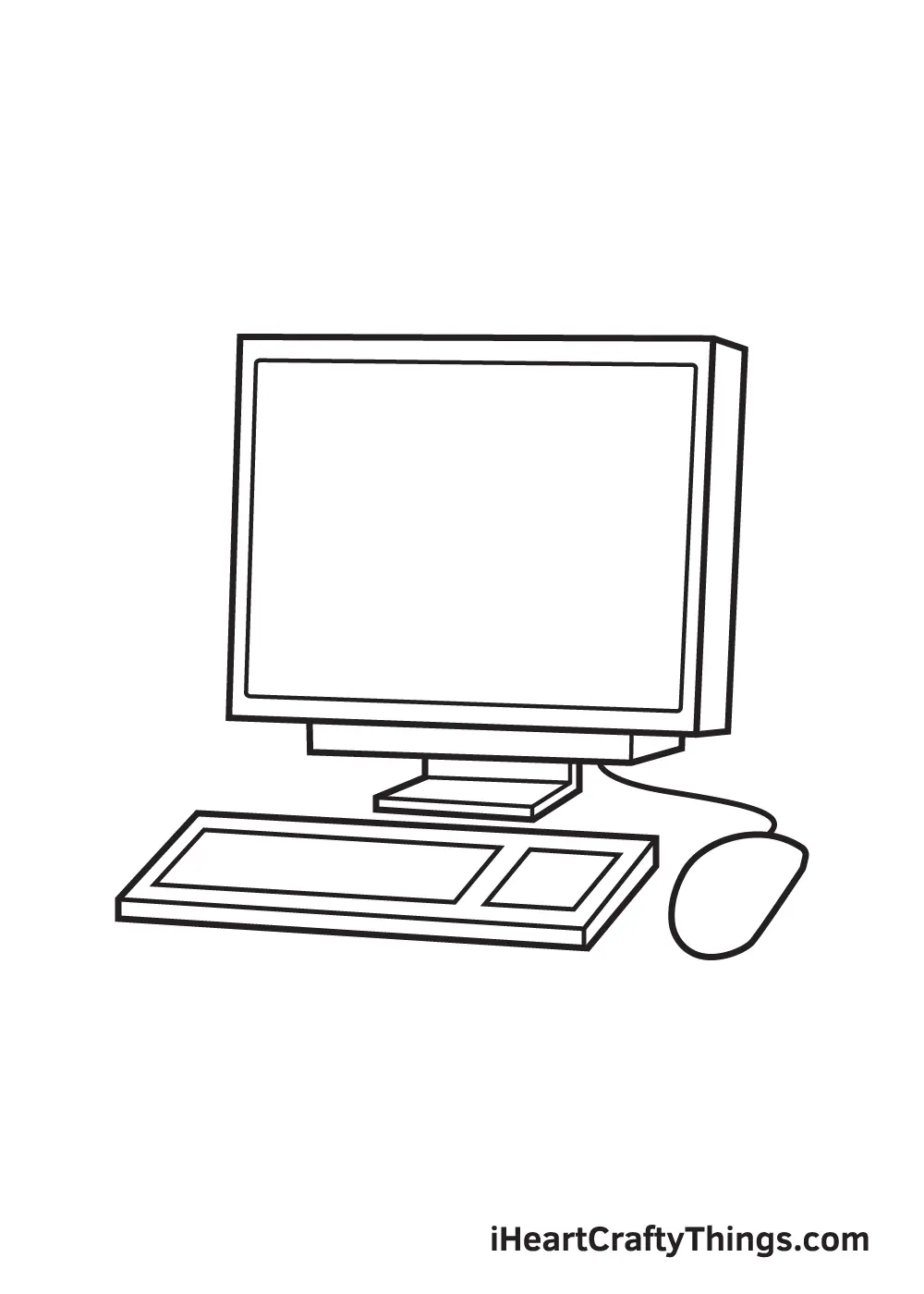
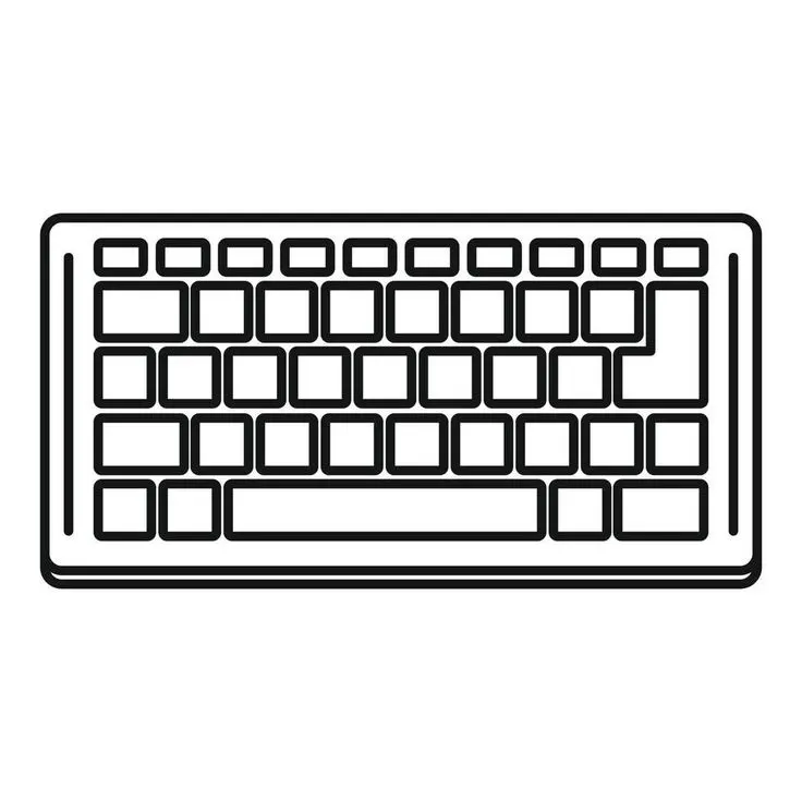
To begin your drawing, start by sketching a thin, elongated rectangle that represents the overall footprint of the keyboard. Use a ruler to ensure your horizontal lines are parallel, then add two vanishing points on the horizon line if you want to create a realistic three-dimensional perspective. This frame acts as the foundation for the entire device, ensuring the rows of keys remain aligned.
Once the frame is set, divide the rectangle into horizontal rows. A standard keyboard typically features five to six rows, including the function keys at the top and the space bar at the bottom. Use light pencil strokes to mark these divisions, as you will need to erase them later. Follow these steps to structure your layout:
- Sketch the outer boundary of the keyboard case.
- Divide the surface into horizontal strips for the key rows.
- Use vertical lines to segment each row into individual key slots.
- Add a slight curve to the top edges of the keys to mimic their ergonomic shape.
How to add realistic details to keys
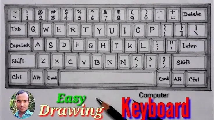
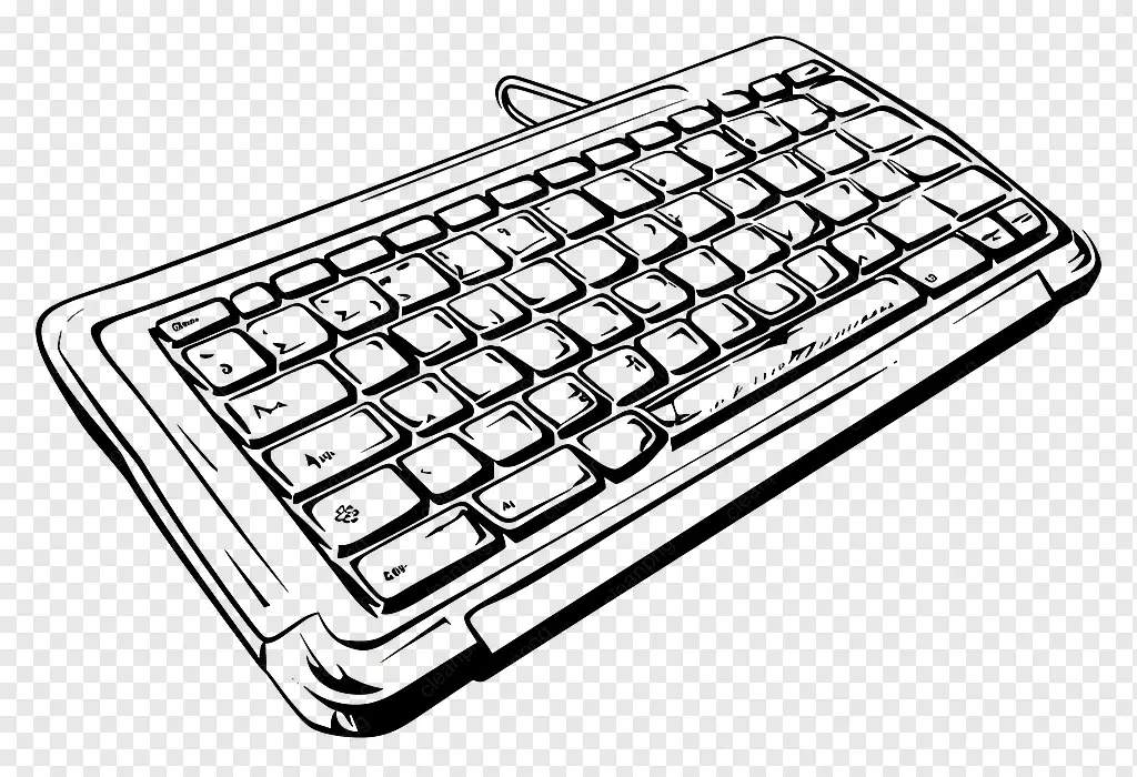
The keys on a keyboard are not simple flat squares; they have distinct profiles and slight indentations. Draw each key as a small, rounded rectangle sitting within your grid. To convey a sense of depth, draw the top surface of the key slightly smaller than the base, which creates a tapered effect. This subtle detail is what separates a amateur sketch from a professional-looking technical drawing.
Pay attention to the unique shapes of special keys like the space bar, Enter key, and Shift keys. These keys occupy more space and often have different proportions than the standard alphanumeric keys. By varying the size and placement of these larger buttons, you provide the viewer with immediate visual context. Remember that keys are usually slightly separated from one another, so leave a thin gap between them to represent the keyboard deck.
Best tools for drawing keyboards
For clean, crisp lines, mechanical pencils are superior to standard graphite pencils because they maintain a consistent point. Use a 2H lead for your initial construction lines, as it is light and easy to erase without smudging the paper. Once you are satisfied with the proportions, switch to an HB or B lead to darken the outlines and add depth to the shadows.
A high-quality eraser is essential for cleaning up the grid lines once the keys are finalized. Consider using a kneaded eraser, which allows you to lift graphite gently without damaging the paper surface. If you prefer a more technical look, use a fine-liner pen with a 0.1mm or 0.3mm nib to ink the final design. This creates a sharp, high-contrast image that looks like a professional product design sketch.
Common mistakes when drawing keyboards
One of the most frequent errors is failing to account for the perspective of the keyboard's slope. Many beginners draw the keys as if they are viewed from directly above, which makes the keyboard look flat and lifeless. Always ensure that the keys on the back rows appear slightly smaller and closer together than the keys in the front row. This technique, known as foreshortening, is crucial for creating a convincing three-dimensional volume.
Another common mistake is inconsistent spacing between keys. If the gaps are uneven, the keyboard will look distorted or broken. Take the time to measure your grid carefully; even a millimeter of difference can throw off the entire composition. Avoid these pitfalls by:
- Checking your parallel lines against the edge of the paper.
- Ensuring the space bar is centered relative to the main letter block.
- Keeping the key shapes uniform across the entire surface.
- Avoiding overly heavy outlines that make the keys look like blocks of stone.
Why keyboard perspective is difficult
The complexity of drawing a keyboard stems from the sheer number of repetitive shapes that must adhere to a strict geometric order. Because the human eye is highly sensitive to patterns, even a minor misalignment in one row of keys becomes immediately apparent to the viewer. This requires a high degree of patience and a steady hand to maintain the grid's integrity across the entire surface of the device.
Furthermore, capturing the subtle shadows cast by each key requires an understanding of light sources. If you place your light source to the top left, the shadows should consistently fall to the bottom right of every key. This uniform shading is what gives the keyboard its tactile, three-dimensional quality. By mastering the interaction between light and form, you transform a simple grid of rectangles into a convincing, functional object that appears ready to be typed upon.
Key facts
- Use a light pencil to draw a large rectangle as your base, then divide it into a slightly smaller inner rectangle for the keys.
- Standard QWERTY keyboards typically feature rows of keys that are slightly offset, a pattern known as a "staggered layout."
- Draw the spacebar as a long, horizontal rectangle at the bottom center, usually measuring about four to five times the width of a standard letter key.
- Add a slight gap between the keys to represent the physical space, which helps prevent the drawing from looking like a solid block.
- Use a ruler to ensure your horizontal rows are perfectly straight, as crooked lines are the most common mistake in technical drawing.
- Include subtle rounded corners on your individual key squares to mimic the ergonomic design of modern mechanical or membrane keyboards.
The bottom line
Drawing a keyboard requires a structured approach that prioritizes geometric precision and consistent spacing. By starting with a defined rectangular frame and utilizing a staggered grid for the keys, you can create a realistic representation. Focus on varying the sizes of functional keys like the spacebar and Enter key to add authenticity. With careful measurement and clean lines, you can effectively capture this essential piece of technology.
People also ask
Why are keyboard keys arranged in a staggered layout?
The QWERTY layout was originally designed for mechanical typewriters to prevent the metal typebars from clashing. While modern keyboards are electronic, this staggered pattern remains the industry standard for muscle memory.
How do I draw the symbols on the keys?
Use a fine-liner pen to place letters in the top-left corner of each key square. Numbers and symbols usually sit above the letters, while special function keys like "Shift" or "Enter" are written in the center.
What is the best way to draw the numeric keypad on the right?
Draw a separate, smaller square block to the right of the main keyboard area. Ensure it has a 4x4 grid layout, which is standard for most full-sized desktop keyboards.
How can I make the keyboard look three-dimensional?
Add thin, diagonal lines connecting the corners of your key squares to the base layer. This creates a "depth" effect, making the keys appear to sit above the keyboard frame.
Should I draw the keyboard cable?
A cable adds realism and a sense of scale to your drawing. Sketch a thick, curved line emerging from the top center or top right of the keyboard frame.
What is the most common mistake when drawing a keyboard?
Beginners often make the keys too large or too uniform. Remember that keys like "Enter," "Backspace," and "Shift" are significantly wider than standard letter keys and require extra space.
This answer was created with the help of AI research tools and reference sources. Spotted an error? Let us know — we correct mistakes quickly. See our editorial policy.