What is the difference between RGB and CMYK?
Short answer
RGB is an additive color model used for digital displays, combining red, green, and blue light to create colors. CMYK is a subtractive model used for physical printing, utilizing cyan, magenta, yellow, and black inks. The primary difference lies in their output medium: RGB creates light on screens, while CMYK uses pigments on paper.
On this page
Why do screens use RGB?
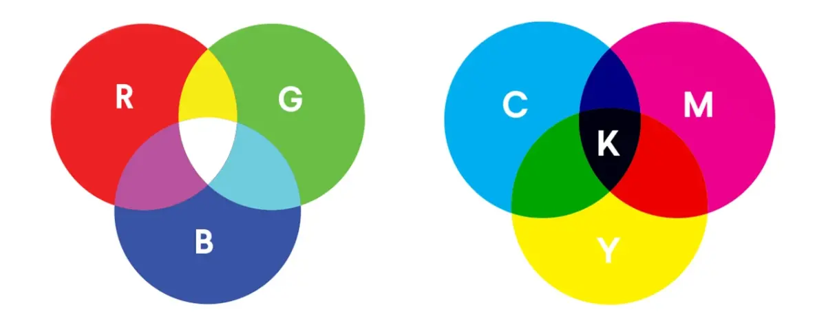
Digital devices like smartphones, computer monitors, and televisions rely on the RGB color model to produce images. This system is additive, meaning that it starts with a black background and adds varying intensities of red, green, and blue light to create a full spectrum of colors. When all three colors are combined at maximum intensity, they produce pure white light. This method mimics the way the human eye perceives color, making it highly efficient for electronic displays.
Because screens are self-illuminated, they can produce a much wider range of vibrant, neon-like colors than physical ink ever could. Designers working in this space have access to millions of potential shades, which is why digital art often looks more luminous than printed materials. If you are designing graphics for a website, social media, or a video presentation, you must always work in RGB mode to ensure the colors appear as intended on the device.
How does CMYK printing work?
The CMYK model is the standard for professional printing, often referred to as process color or four-color printing. Unlike the additive RGB model, CMYK is subtractive. It begins with a white surface—usually paper—and layers translucent inks to absorb, or subtract, specific wavelengths of light. The four primary inks used are:
- Cyan (C)
- Magenta (M)
- Yellow (Y)
- Key/Black (K)
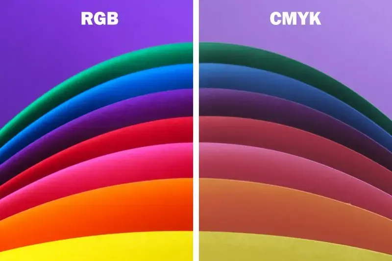
The "Key" color is black ink, which is added to provide depth, contrast, and crisp text that would be difficult to achieve by mixing cyan, magenta, and yellow alone. Because ink absorbs light rather than emitting it, the color gamut of CMYK is significantly narrower than RGB. This is why a photograph that looks brilliant on your monitor may appear slightly duller or muted once it is transferred to paper. Professional printers use these four plates to recreate the full-color spectrum through tiny, overlapping dots.
What is the difference in color gamut?
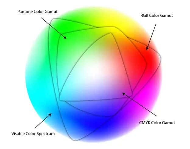
The term "gamut" refers to the total range of colors that a specific device or color space can reproduce. RGB has a much larger gamut than CMYK because light can generate colors that pigments cannot replicate. For example, many bright neons and saturated blues found in digital art simply do not exist in the world of physical ink. When you convert an RGB image to CMYK, the software must perform a "gamut mapping" process to approximate the digital colors using the limited palette of ink.
This conversion process often leads to a phenomenon where colors appear to shift or lose their intensity. To manage these expectations, designers often use color profiles to preview how their work will look after printing. If you are preparing a file for a professional press, it is essential to understand these limitations:
- Identify the specific color profile required by your printer, such as U.S. Web Coated (SWOP) v2.
- Use the "Soft Proofing" feature in your design software to see which colors will shift.
- Manually adjust any colors that appear muddy or dull after the conversion to CMYK.
Common mistakes when preparing files for print
One of the most frequent errors for beginners is designing a print project, such as a brochure or business card, entirely in RGB mode. While the file might look perfect on screen, the final printed product may look disappointing because the printer will force a conversion that results in inaccurate color reproduction. Another common mistake is failing to account for the "rich black" versus "true black" issue.
- Using 100% of all four CMYK colors to create black can cause oversaturation, leading to wet, smudged paper.
- Relying solely on the "K" channel for large black areas can result in a dark gray or washed-out appearance.
- Forgetting to convert images to CMYK before sending files to a commercial printer can lead to unexpected color shifts.
To avoid these pitfalls, always set your document color mode to CMYK at the very beginning of your project. This ensures that every color you pick is within the printable range from the start, preventing surprises during the final production phase.
Best practices for converting between color modes
When you must convert an existing digital asset for a physical project, the process requires careful oversight to maintain visual integrity. Never rely on an automatic conversion without inspecting the result, as the software's mathematical approximation may not align with your creative intent. Instead, follow these steps to ensure a professional outcome:
- Duplicate your original RGB file to preserve the high-quality digital master.
- Convert the copy to CMYK and inspect the image for areas where colors have shifted significantly.
- Use adjustment layers to selectively boost saturation or contrast in areas that lost detail during the conversion.
By treating the conversion as a deliberate editing step rather than a final export setting, you maintain control over the final product. Always remember that the goal is to create a printed piece that looks as close to your vision as possible, even if the physical medium cannot replicate the exact luminosity of your screen. Following these guidelines will help you bridge the gap between digital design and high-quality printed materials.
Key facts
- RGB stands for Red, Green, and Blue, while CMYK stands for Cyan, Magenta, Yellow, and Key (black).
- RGB is an additive color model used for digital screens, where colors are created by adding light.
- CMYK is a subtractive color model used for physical printing, where inks absorb light to create colors.
- Digital screens can display a wider gamut of vibrant, neon-like colors than traditional printer inks can reproduce.
- Always convert your files to CMYK before sending them to a professional printer to avoid unexpected color shifts.
- The "Key" in CMYK represents black ink, which is added because mixing cyan, magenta, and yellow creates a muddy brown rather than pure black.
The bottom line
The fundamental difference between RGB and CMYK lies in their purpose: RGB is for light-based digital displays, while CMYK is for ink-based physical printing. Choosing the wrong mode leads to significant color inaccuracies, as printers struggle to replicate the vibrant light of a screen. Always design in the color space that matches your final output to ensure your creative work appears exactly as you intended.
People also ask
Why do my printed colors look different than they do on my monitor?
Monitors emit light to create color, while paper reflects it, meaning the color ranges simply do not match perfectly. Your screen can display bright, glowing colors that physical ink cannot replicate, leading to a duller appearance in print.
Can I convert an RGB image to CMYK without losing quality?
You can convert the color mode, but you will experience a "gamut shift" where certain saturated colors become muted. It is best to work in the intended color space from the start of your project to maintain control over the final output.
What happens if I print a file that is still in RGB mode?
The printer software will attempt to translate the RGB data into CMYK automatically, often resulting in inaccurate or washed-out colors. This automated conversion frequently fails to account for specific brand colors or deep blacks, leading to poor print quality.
Is black ink the same thing as "Rich Black"?
Standard black ink is just the "K" channel, whereas "Rich Black" is a mixture of cyan, magenta, yellow, and black. Rich black creates a deeper, more intense tone, but it should be used carefully to avoid ink saturation issues on thin paper.
Which color mode should I use for social media graphics?
You should always use RGB for any content intended for digital viewing, such as websites, Instagram, or email newsletters. RGB provides the necessary color depth to ensure your images look vibrant on smartphones and computer displays.
How do I check if my document is set to the correct color mode?
In professional design software like Adobe Illustrator or Photoshop, check the document tab or the "Color Mode" setting in your file info. If you see "RGB" in the title bar, your file is currently optimized for screens rather than for printing presses.
This answer was created with the help of AI research tools and reference sources. Spotted an error? Let us know — we correct mistakes quickly. See our editorial policy.