What are earth tones?
Short answer
Earth tones are a color palette inspired by natural elements found in the environment, such as soil, stone, foliage, and sky. These hues typically feature muted, desaturated, or brownish undertones, creating a grounded and organic aesthetic. Common examples include terracotta, ochre, sage green, slate gray, warm beige, and deep umber.
On this page
What colors are considered earth tones?
Earth tones are defined by their connection to the physical world, moving away from high-saturation, artificial pigments toward more subtle, muted variations. These colors derive their character from the minerals and organic matter found in the crust of the planet. While the spectrum is broad, it is categorized by its warmth and ability to blend harmoniously with other natural shades.
The primary colors within this palette include:
- Browns: Ranging from light taupe and sandy beige to deep chocolate and espresso.
- Greens: Muted, earthy variations like sage, olive, moss, and forest green.
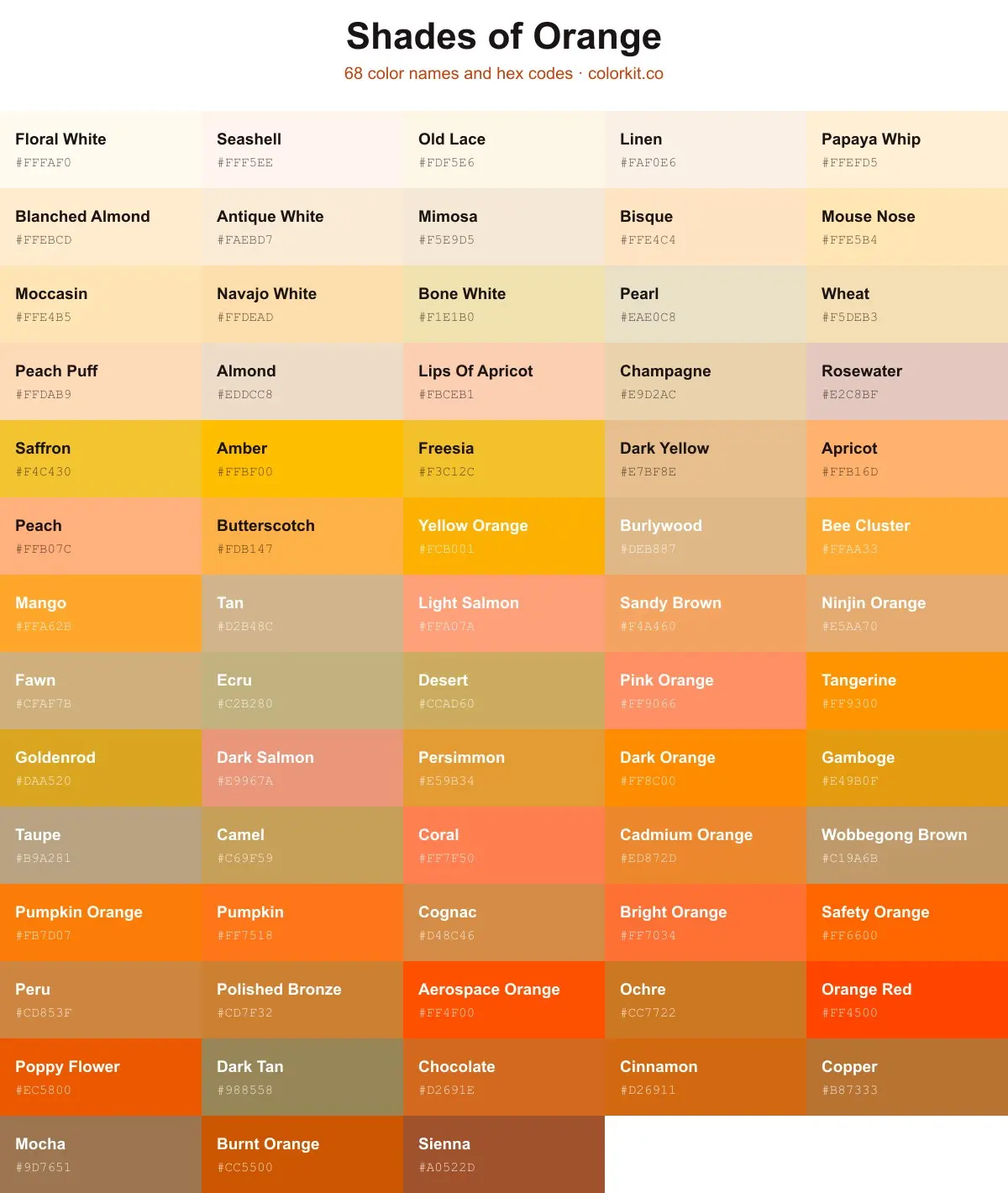
- Oranges and Reds: Rust, terracotta, burnt orange, and brick red.
- Yellows: Mustard, ochre, and goldenrod.
- Grays: Slate, charcoal, and stone gray, which mimic natural rock formations.
These colors are often referred to as "warm neutrals," though the inclusion of deep greens and slate grays adds a cooling effect. By utilizing these shades, designers can create spaces or compositions that feel stable, calm, and inherently connected to the outdoors.
How to use earth tones in interior design
Using earth tones in home decor is a popular technique for creating a sanctuary-like atmosphere. Because these colors are inherently balanced, they are difficult to "get wrong" when paired together. The secret lies in layering textures rather than relying on a single flat color, which prevents the space from feeling dull or monotonous.
To successfully incorporate these tones in your living space, follow these steps:
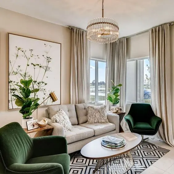
- Select a neutral base color, such as cream or light beige, for your largest surfaces like walls or area rugs.
- Introduce a secondary, bolder earth tone, such as terracotta or olive green, through accent furniture or curtains.
- Layer in natural materials like wood, jute, linen, or stone to add depth and tactile interest.
- Use metallic accents, such as matte brass or bronze, to add a touch of warmth that complements the organic palette.
By following this hierarchy, you ensure that the room remains airy while still benefiting from the grounding influence of the earth-inspired color scheme.
Why earth tones are popular in fashion
Earth tones have remained a staple in fashion because they are universally flattering and highly versatile. Unlike neon or primary colors, which can be difficult to style, earth tones act as a foundation for a capsule wardrobe. They provide a sophisticated look that transitions seamlessly between seasons, making them a practical choice for long-term investment pieces.
The enduring appeal of these colors stems from their ability to pair well with almost any skin tone. For instance, those with warm undertones often gravitate toward rich ochres and rusts, while those with cooler undertones find success with slate grays and deep moss greens. Because these colors are desaturated, they do not compete with one another, allowing for effortless layering of different garments. A monochromatic outfit featuring varying shades of brown—from light tan to dark mocha—creates a sleek, high-end appearance that is both timeless and modern.
Common mistakes when using earth tones
One of the most frequent errors when working with earth tones is the failure to incorporate enough contrast. Because these colors are muted, a room or outfit composed entirely of similar mid-tone shades can quickly lose its visual impact and appear "muddy." Without a range of light and dark values, the design lacks a focal point, leading to a flat and uninspired result.
Another common mistake is ignoring the importance of texture. In a palette devoid of high-contrast colors, texture becomes the primary way to define space and interest. If you use only smooth, matte surfaces, the environment can feel sterile. To avoid this, consider these additions:
- Incorporate rough-hewn wood furniture or exposed brick walls.
- Add soft, tactile fabrics like chunky wool throws, velvet pillows, or linen curtains.
- Use matte finishes for paint and metal, as high-gloss surfaces can clash with the organic nature of these colors.
How to choose the right earth tone palette
Selecting the right combination of earth tones requires observing the natural light in your environment. Colors that appear warm and inviting in direct sunlight may look dark or dreary in a room with limited natural light. Always test paint swatches or fabric samples at different times of the day to see how the shifting light affects the saturation and undertone of the colors.
When building your palette, aim for a 60-30-10 rule: 60 percent of your space should be a dominant neutral, 30 percent a secondary earth tone, and 10 percent a vibrant accent. For example, a room with beige walls (60%) might feature forest green chairs (30%) and small pops of burnt orange in the artwork or throw pillows (10%). This structure ensures that your color choices remain intentional and balanced. By following these guidelines, you can create a cohesive aesthetic that feels both professional and deeply personal, capturing the essence of the natural world within your own home.
Key facts
- Earth tones are a color palette inspired by natural elements such as soil, stone, sky, and vegetation.
- The primary colors in this category include brown, tan, beige, terracotta, sage green, ochre, and slate gray.
- These colors are characterized by low saturation and high warmth, making them appear muted rather than vibrant.
- When decorating, use the 60-30-10 rule: 60% of the room should be a neutral base, 30% a secondary tone, and 10% an accent color.
- Avoid using only one shade of brown, as this can make a space feel flat; instead, mix textures like wood, linen, and wool to add depth.
- Earth tones are considered "timeless" because they do not rely on fleeting fashion trends and work well in almost any lighting condition.
The bottom line
Earth tones provide a versatile, grounding color palette that mimics the natural world. By layering muted browns, greens, and grays with diverse textures, you can create a balanced and timeless aesthetic in any environment. Whether you are painting a room or selecting textiles, these colors offer a reliable way to foster comfort and sophistication without the risk of appearing dated or overly trendy in your home.
People also ask
Do earth tones make a room look smaller?
Generally, lighter earth tones like cream or sand can make a room feel larger and more open. Darker tones like chocolate brown or forest green can create a cozy, intimate atmosphere but may shrink the visual space if the room lacks natural light.
Are earth tones considered warm or cool colors?
Most earth tones are warm because they contain undertones of red, yellow, or orange. However, some earth tones like slate blue or sage green are considered cool, providing a balanced, calming effect in interior design.
Can I mix earth tones with bright colors?
Yes, earth tones serve as an excellent neutral foundation that allows brighter colors to pop. Using a vibrant accent color like mustard yellow or burnt orange against a muted beige backdrop creates a sophisticated, high-contrast look.
What is the best way to choose an earth tone paint color?
Always test paint samples on your wall at different times of the day. Natural light shifts significantly, which can drastically change how a muted color appears in the morning versus the evening.
Why are earth tones popular in home staging?
They are popular because they are universally appealing and create a sense of calm and stability. By avoiding bold, polarizing colors, sellers can help potential buyers envision their own belongings in the space more easily.
Are there specific earth tones for different seasons?
While earth tones are year-round, deeper browns and rusts are often associated with autumn and winter. Lighter, greener tones like olive or clay are frequently used in spring and summer to reflect the growth of nature.
This answer was created with the help of AI research tools and reference sources. Spotted an error? Let us know — we correct mistakes quickly. See our editorial policy.