How do you shade with pen and ink?
Short answer
Shading with pen and ink is achieved by manipulating the density and spacing of marks rather than varying pressure. Artists use techniques like hatching, cross-hatching, stippling, and scumbling to build value. By layering these patterns, you control how much white paper remains visible, effectively creating shadows, depth, and three-dimensional form on a flat surface.
On this page
How to master basic pen shading techniques
The foundation of ink shading relies on the proximity of lines. Hatching involves drawing parallel lines close together; the closer they are, the darker the value appears. Cross-hatching adds a second layer of lines at an angle to the first, which creates a denser, darker texture suitable for deep shadows. Stippling uses small dots to build tone, where the concentration of dots determines the darkness of the area.
To practice these techniques, follow these fundamental steps:
- Draw a series of squares on a sheet of paper.
- Fill the first square with light, widely spaced marks.
- Gradually increase the density of marks in each subsequent square until the final square is nearly solid black.
- Experiment with varying the length and thickness of your strokes to see how they influence the overall texture and depth of the shading.
Best pens and paper for beginners
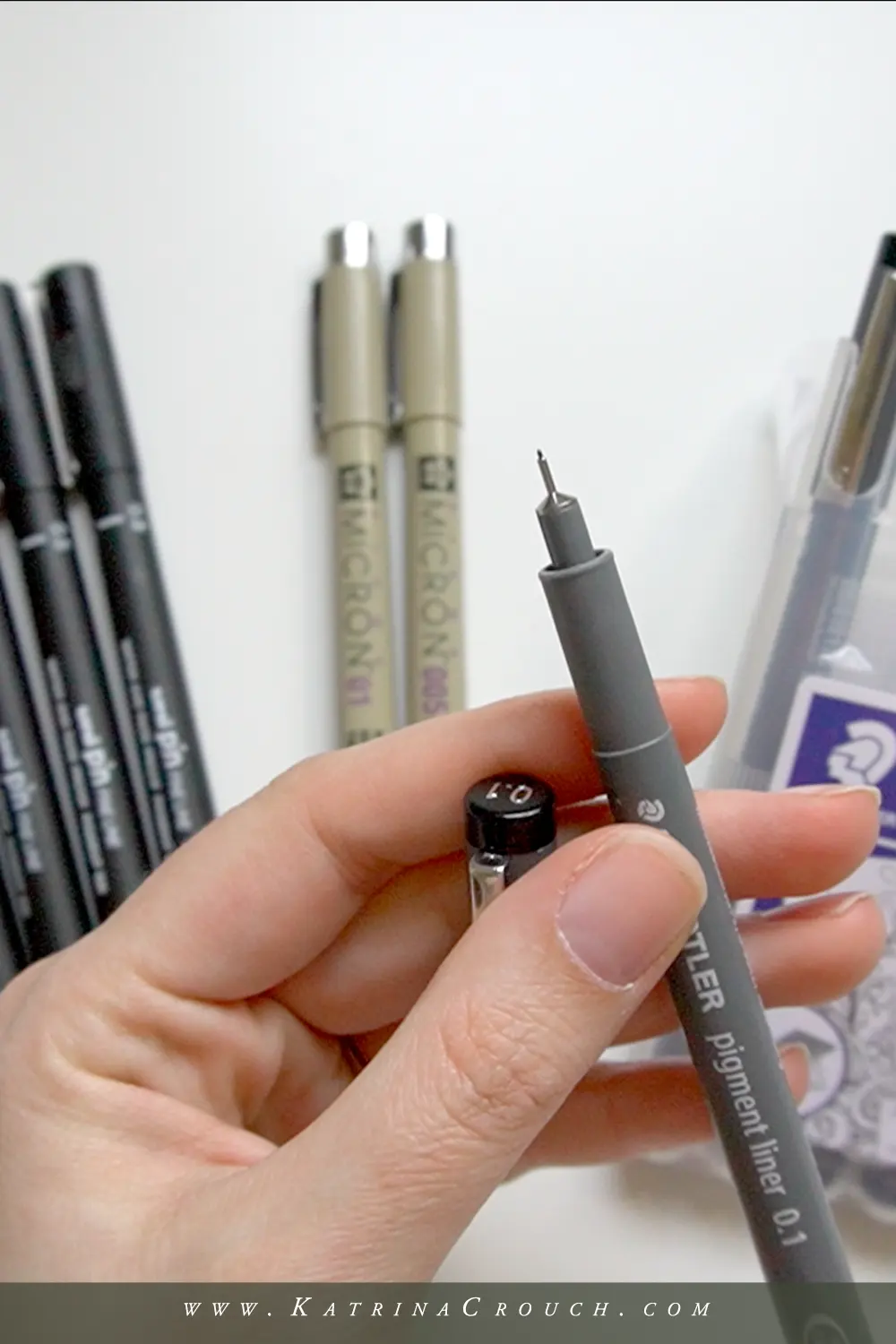
Choosing the right equipment is essential for consistent shading. Technical pens, such as those with felt or plastic tips, provide a uniform line width, which is ideal for beginners learning to control mark density. Fine-liner pens are widely available and come in various sizes, typically ranging from 0.05mm to 1.0mm. These allow for precise control when building up complex textures or subtle gradients.
Paper selection is equally important for ink work. Smooth, high-quality bristol board or heavy-weight drawing paper is preferred because it prevents the ink from bleeding or feathering. Avoid standard printer paper, as its porous surface can cause ink to spread, making it difficult to maintain clean, sharp lines. Using archival-quality, acid-free paper ensures that your work remains vibrant and does not yellow over time, preserving the integrity of your shading efforts.
Why ink shading creates depth
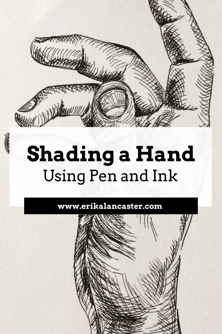
Shading with ink creates the illusion of volume by manipulating light and shadow. Because ink is inherently opaque, you cannot erase or blend it like graphite or charcoal. Instead, you must use the white of the paper as your light source. By leaving more paper exposed in areas where light hits an object, you create highlights, while densely packed ink marks define the areas furthest from the light source.
This process requires careful planning. Before applying permanent ink, many artists lightly sketch their composition with a pencil to map out the light and shadow regions. This "mapping" phase helps you identify where to place your darkest shadows and where to preserve the brightest highlights. By systematically working from the lightest values to the darkest, you can build up the form of an object gradually, ensuring that the transition between light and shadow remains smooth and convincing.
Common mistakes when shading with ink
One of the most frequent errors is rushing the application of ink. Because ink is unforgiving, mistakes are difficult to correct, leading to frustration. Beginners often apply too much pressure, which can damage the pen tip or cause the ink to pool on the paper. Another common issue is failing to maintain consistent spacing between marks, which results in an uneven, patchy appearance that disrupts the illusion of a smooth gradient.
To avoid these pitfalls, keep the following tips in mind:
- Always test your pen on a scrap piece of paper before touching your final drawing.
- Keep your hand steady and rotate the paper for better control of your stroke angle.
- Avoid smudging wet ink by working from the top left of the page to the bottom right if you are right-handed.
- Do not overwork an area; layering too much ink can cause the paper to pill or tear.
How to create texture through mark-making
Beyond simple gradients, ink shading allows for the representation of complex textures. Scumbling, which involves using small, scribbled, or circular marks, is excellent for rendering rough surfaces like stone, foliage, or hair. By varying the size and intensity of these scribbles, you can suggest intricate details that would be impossible to capture with standard hatching. This technique adds a dynamic, organic quality to your drawings that feels more expressive and less mechanical.
The key to successful texture is observation. Look closely at your subject to determine the direction of the surface grain or the way light interacts with the material. If you are drawing wood, follow the grain with your lines; if you are drawing fabric, use cross-hatching to mimic the weave. By aligning your shading marks with the physical structure of the object, you enhance the realism of the piece. Consistent practice with these varied mark-making styles will eventually allow you to develop a unique personal aesthetic that defines your work.
Key facts
- Cross-hatching involves layering sets of parallel lines at angles to create darker values.
- Stippling uses thousands of tiny dots to build up tone, with higher density creating deeper shadows.
- Varying the distance between lines, known as line spacing, directly controls the perceived lightness of a shaded area.
- Thicker pen nibs produce bolder, darker marks, while finer nibs allow for delicate, subtle transitions.
- Contour hatching follows the physical shape of an object to emphasize its three-dimensional volume.
- Ink does not blend like graphite, so you must plan your light source and shadow placement before applying permanent marks.
The bottom line
Mastering pen and ink shading requires patience and a strategic approach to mark-making. Because ink cannot be blended, you must rely on techniques like cross-hatching, stippling, and contouring to build value. By carefully controlling the density and direction of your lines, you can effectively represent light, shadow, and texture. Practice consistent pressure and plan your composition thoroughly to achieve professional, high-contrast results in your drawings.
People also ask
Can I erase ink if I make a mistake?
Generally, ink is permanent and cannot be erased once it touches the paper. You can hide minor errors by incorporating them into darker shadow areas or using an opaque white gouache to paint over the mistake.
What type of paper is best for pen and ink shading?
Smooth, hot-pressed watercolor paper or bristol board is ideal because the surface prevents the ink from bleeding or feathering. Rough paper can snag the pen nib and cause unwanted ink splatters.
How do I create a smooth gradient with ink?
You create gradients by gradually increasing the density of your lines or dots as you move toward the shadow. By spacing marks further apart in light areas and closer together in dark areas, you simulate a soft transition.
Should I use a waterproof ink?
Using waterproof ink is highly recommended, especially if you plan to add watercolor or markers over your ink work later. Non-waterproof inks will smear or run the moment they come into contact with any liquid.
How do I prevent hand smudging while shading?
Place a clean piece of scrap paper under your drawing hand to act as a barrier between your skin and the ink. This prevents oils from your hand from transferring to the paper and keeps fresh ink from smearing.
Why do my shaded areas look flat?
Flat shading often results from using uniform line pressure or failing to follow the object’s contours. Ensure your lines curve with the form of the subject to create the illusion of depth and dimension.
This answer was created with the help of AI research tools and reference sources. Spotted an error? Let us know — we correct mistakes quickly. See our editorial policy.