How do you draw a treasure chest?
Short answer
Drawing a treasure chest involves constructing a three-dimensional rectangular prism for the base and a semi-cylindrical shape for the lid. By applying basic geometric principles, perspective, and shading, you can create the illusion of depth. Focus on the hinges, reinforced metal bands, and a central lock to achieve a classic, authentic appearance.
On this page
How to draw a treasure chest step by step
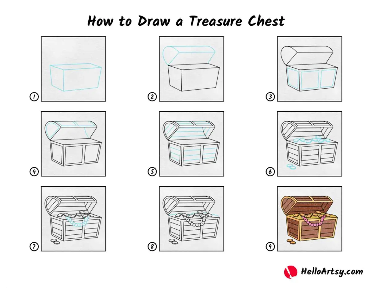
To begin your drawing, start by sketching a simple rectangular box to serve as the base of the chest. Use light pencil strokes to establish the perspective, ensuring the side panels recede toward a vanishing point if you want a realistic look. Once the base is set, draw a curved, arched line across the top to define the lid. This lid should mirror the width of the base to ensure the chest looks structurally sound.
After establishing the primary shapes, add the structural details that give the chest its character. Most treasure chests feature thick, vertical metal bands running down the sides and across the lid. Add a prominent lock plate in the center of the front panel to serve as the focal point of your illustration. Refine your lines with a darker pencil or ink, then erase the initial construction guides to reveal a clean, professional-looking chest.
Best tools for drawing treasure chests
For beginners, a standard HB graphite pencil is ideal for initial sketching because it is easy to erase. Once the structure is finalized, a 2B or 4B pencil works well for adding depth and shadow, as these softer leads produce richer, darker tones. If you prefer working with ink, use a fine-liner pen with a 0.5mm tip to define the edges and add intricate details like rivets or wood grain textures.
When adding color or shading, consider the following tools to enhance your work:
- Blending stumps or tortillons to smooth out charcoal or graphite shadows.
- Kneaded erasers to lift highlights from the metal bands or the lock.
- White gel pens to add sharp, reflective highlights on the metallic surfaces.
- Alcohol-based markers or watercolors if you intend to add a rustic, aged wood finish.
Why perspective matters in drawing
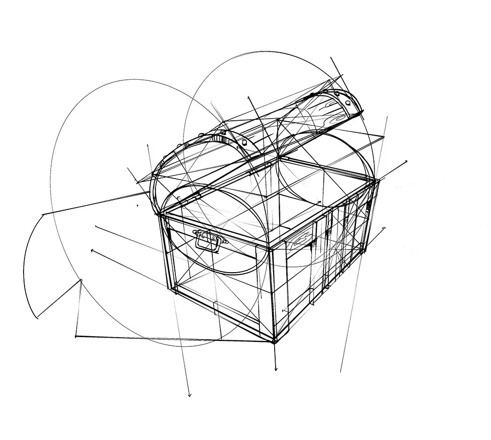
Perspective is the most critical element when drawing a treasure chest because it defines how the object sits in space. Without proper perspective, the chest will look flat or distorted, making it difficult for the viewer to perceive its volume. By using a two-point perspective technique, you can ensure that the sides of the chest appear to recede correctly, which adds a sense of realism and weight to the object.
To maintain accurate proportions, follow these foundational rules:
- Keep your vertical lines perfectly straight to ensure the chest does not look like it is leaning.
- Ensure the lid’s curve is consistent on both sides to avoid a lopsided appearance.
- Use lighter lines for parts of the chest that are further away to create atmospheric depth.
- Check that the hinges align perfectly with the lid’s pivot point to make the chest appear functional.

Common mistakes when drawing treasure chests
One of the most frequent errors is failing to account for the thickness of the materials. Beginners often draw the chest as if it were made of paper, forgetting that wood planks and metal bands have physical depth. Always draw a double line for the edges of the lid and the base to represent the thickness of the wood. Neglecting this detail makes the chest look fragile rather than sturdy and secure.
Another common mistake is inconsistent lighting, which can make the chest look like a collection of unrelated shapes. If your light source is coming from the top right, ensure that all shadows fall toward the bottom left. Avoid smudging your shading with your fingers, as this creates a muddy look that takes away from the crisp, metallic, or wooden textures you are trying to represent in your final drawing.
How to add texture and detail
Adding texture is what transforms a simple box into a weathered, ancient treasure chest. Use short, wavy lines to indicate wood grain on the panels, and add small circles along the metal bands to represent rivets or nails. These tiny details provide a sense of history, suggesting that the chest has been handled, transported, and stored in various environments over many years.
To make your chest look truly authentic, consider adding these final touches:
- Scratches and nicks on the wooden surfaces to suggest age and wear.
- A slight patina or oxidation on the metal parts to indicate exposure to the elements.
- A heavy, oversized padlock that looks like it has been forged by hand.
- Shadows cast by the chest onto the ground to anchor it firmly within the scene.
By layering these textures carefully, you create a compelling image that tells a story of adventure and hidden wealth.
Key facts
- Start by drawing a simple rectangular prism to establish the chest's base and depth.
- Use a semi-cylinder shape on top of the rectangle to create the iconic rounded lid.
- Add thick, vertical bands across the corners and center to represent iron reinforcement straps.
- Place small circles along these bands to simulate the appearance of heavy metal rivets.
- Include a small, shield-shaped lock plate on the front center of the chest for detail.
- Use vanishing points if you want to apply linear perspective for a realistic 3D appearance.
The bottom line
Drawing a treasure chest is an exercise in basic geometric construction and effective shading. By starting with a simple rectangular base and a cylindrical lid, you establish a solid foundation. Adding structural details like iron bands, rivets, and wood grain provides texture and character. Mastering these fundamental shapes allows you to create a convincing, three-dimensional object that serves as a classic centerpiece for any adventure-themed illustration.
People also ask
How do I make the treasure chest look metallic?
Use high-contrast shading by placing dark shadows near the edges and bright white highlights on the curved surfaces. This creates a reflective sheen that mimics the appearance of polished iron or gold.
Should I use a ruler for the lines?
Using a ruler is helpful for the initial structural box, but freehand lines often look more authentic for aged wood. A slight wobble in your lines can suggest that the chest is old and worn.
What is the best way to draw the wood grain?
Draw long, slightly wavy parallel lines across the flat surfaces of the chest. Vary the spacing between lines to make the wood look natural rather than perfectly manufactured.
How do I draw the chest open?
Draw the lid as a separate curved shape tilted backward, connected to the base by visible hinges. Ensure the interior of the box is shaded darker to create the illusion of depth.
What are common mistakes when drawing a chest?
A frequent error is neglecting perspective, which makes the chest look flat or distorted. Always ensure the parallel lines of the base converge toward a single point on the horizon.
How can I make the chest look like it is full of treasure?
Draw irregular, jagged shapes spilling out over the front edge of the open lid. Use small dots and sparkles to represent the glint of coins and jewels catching the light.
This answer was created with the help of AI research tools and reference sources. Spotted an error? Let us know — we correct mistakes quickly. See our editorial policy.