How do you draw a realistic flower?
Short answer
Drawing a realistic flower requires observing organic geometry, light, and shadow. Begin by sketching simple shapes to establish proportions, then refine the contours with delicate lines. Apply shading to create depth, focusing on how light hits the petals. Consistent practice with botanical references helps translate complex natural forms into accurate artistic representations.
On this page
How to structure a flower drawing
Realistic botanical art begins with understanding the underlying geometry of the plant. Flowers are not flat shapes; they are three-dimensional structures composed of spheres, cylinders, and cones. Start by lightly sketching a central circle for the flower head and a thin line for the stem. Use these basic shapes to map out where the petals will sit, ensuring they follow the perspective of the flower’s orientation.
Once the basic framework is established, refine the outlines to reflect the organic, irregular nature of petals. Avoid drawing perfectly symmetrical or uniform shapes, as nature is rarely exact. Instead, focus on the overlapping layers that give the flower its volume. By building the drawing from simple, light geometric shapes, you maintain control over the overall composition before committing to the final, detailed line work.
Best tools for realistic flower drawing
Achieving realism requires a variety of graphite pencils to capture the full spectrum of light and shadow. A standard HB pencil is ideal for initial light sketches, while 2B and 4B pencils provide the soft, dark tones necessary for deep shadows. For the finest details, such as the delicate veins on a leaf or the texture of a stamen, use a sharpened H or 2H pencil.
The choice of paper is equally vital for a professional finish. A medium-weight, acid-free drawing paper with a slight tooth, or texture, allows the graphite to adhere properly and prevents smudging. Consider using the following tools to enhance your technique:
- Kneaded erasers: These can be molded into specific shapes to lift graphite and create highlights on petals.
- Blending stumps: Use these to smooth out shading, creating soft transitions between light and dark areas.
- Precision sharpeners: Keeping your pencils sharp is essential for clean lines and intricate detailing.
How to shade petals for depth
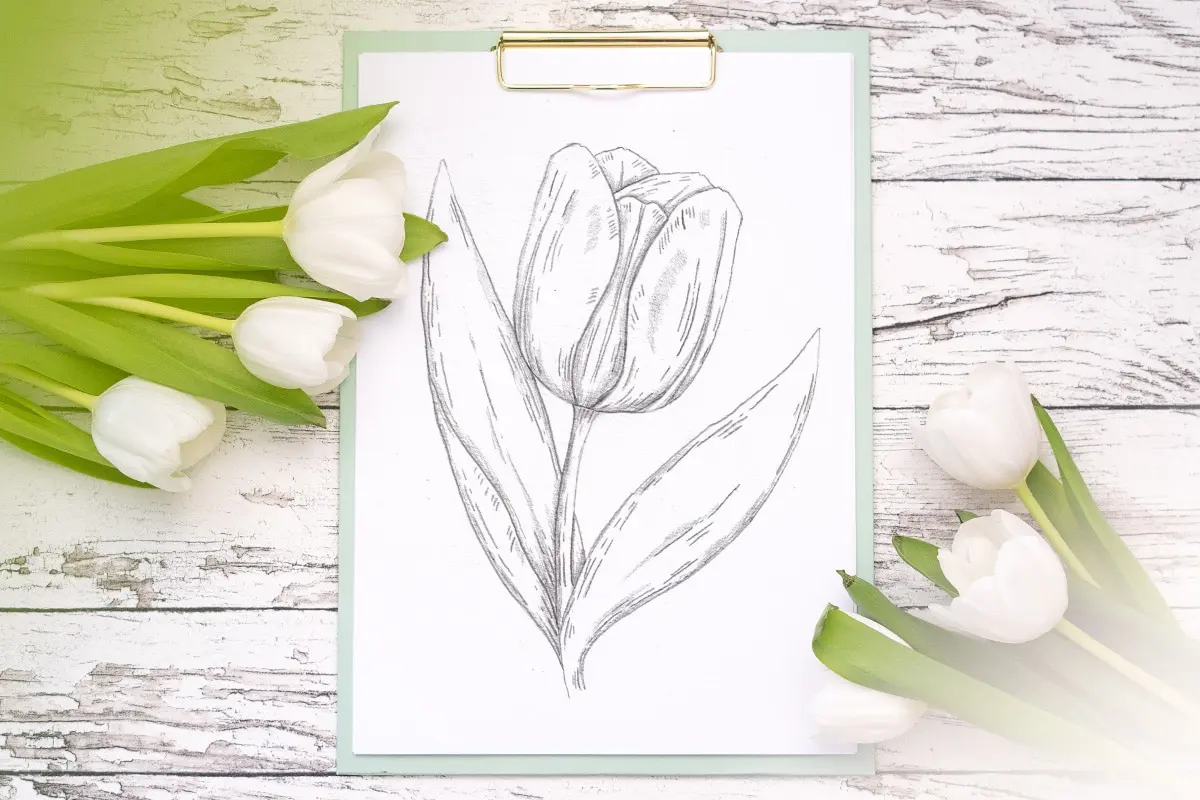
Shading is the process that transforms a flat outline into a realistic, tactile object. Observe the light source carefully; if the light comes from the upper left, the right side of the flower and the base of the petals will be in shadow. Apply graphite in smooth, directional strokes that follow the curve of the petal, rather than using random cross-hatching.
Focus on the transition between light and shadow, known as the terminator line. This area often requires a soft gradient to look natural. To create realistic depth, follow these steps:
- Identify the darkest areas, typically where petals overlap or meet the center of the flower.
- Apply a light base layer of graphite across the entire petal to establish a mid-tone.
- Gradually build up the shadows using darker pencils, leaving the brightest areas untouched to represent highlights.
- Use a blending stump to soften the edges, ensuring the transition between tones is subtle and gradual.
Why flowers look flat in drawings
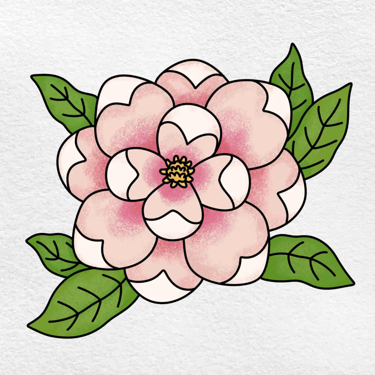
A common issue for beginners is the tendency to outline every single petal with heavy, dark lines. In reality, petals are defined by changes in light and shadow, not by hard ink borders. If you outline every detail, the flower will appear like a cartoon or a coloring book page. Instead, let the shadows define the edges where two petals meet, using lines only where there is a clear physical crease or boundary.
Another reason for a lack of realism is the failure to account for foreshortening. When a petal is angled toward the viewer, it appears shorter and wider than it actually is. Study your reference photo to see how these shapes change based on their angle. By accurately depicting how petals fold and recede into space, you create a sense of distance and volume that makes the flower appear to pop off the page.
Common mistakes when drawing flowers
Many artists struggle because they attempt to draw what they think a flower looks like rather than what they actually see. This is known as "symbol drawing," where you rely on a mental shorthand for a petal shape instead of observing the specific, unique curves of the specimen in front of you. Always keep your reference material close and check your proportions frequently against the original image.
Another frequent error involves neglecting the stem and leaves, which are essential for context. A flower is part of a larger plant system, and ignoring the stem can make the bloom look like it is floating in mid-air. To avoid these pitfalls, keep these guidelines in mind:
- Do not rush the initial sketch; if the foundation is wrong, the final shading cannot fix the proportions.
- Avoid using your finger to smudge graphite, as the oils from your skin can damage the paper and create uneven, muddy patches.
- Remember to vary your line weight; use lighter, thinner lines for distant petals and bolder, darker lines for the foreground to create a natural sense of depth.
Key facts
- Observe the flower’s "gesture" or primary curve before adding any fine details.
- Use a light 2H pencil to sketch the initial structure, as dark lines are difficult to erase.
- Identify the light source early to ensure shadows consistently fall on the opposite side.
- Build depth by layering graphite from light gray to deep, saturated black.
- Use a kneaded eraser to lift highlights, which creates the illusion of dew or petals catching light.
- Study the botanical structure, noting that petals often overlap in a spiral or radial pattern.
The bottom line
Drawing a realistic flower requires a transition from structural observation to careful tonal layering. By prioritizing the light source and using varied pencil grades, you can replicate the delicate volume of petals. Avoid heavy outlines and prioritize soft transitions between light and shadow. With consistent practice in observing natural growth patterns, you will develop the technical precision necessary to capture the complex beauty of botanical subjects.
People also ask
What is the best pencil grade for shading petals?
Use a range of pencils, starting with an HB for outlines and moving to 2B or 4B for soft, dark shadows. A 6B pencil is ideal for the deepest crevices where petals meet the stem.
How do I make a drawing look three-dimensional?
Focus on "form shadows," which occur where the light hits the curve of the petal. By keeping the edges soft and blending transitions, you create a sense of volume rather than a flat shape.
Should I draw the stem or the bloom first?
Always start with the bloom to establish the focal point and scale. Once the flower head is positioned, draw the stem to connect naturally to the base of the petals.
How do I avoid smudging my graphite?
Place a clean sheet of paper under your drawing hand to prevent oils and graphite from transferring to the page. Work from the top of the page to the bottom to minimize contact with finished areas.
Why does my flower look cartoonish?
This often happens when outlines are too bold or uniform. Replace thick, dark outlines with subtle shifts in shading to define the edges of the petals.
Is it better to draw from a photo or a live flower?
Drawing from a live flower is superior because it allows you to observe the object from multiple angles. You can see how light interacts with the textures and depth of the petals in real time.
This answer was created with the help of AI research tools and reference sources. Spotted an error? Let us know — we correct mistakes quickly. See our editorial policy.