How do you draw waves?
Short answer
Drawing waves requires capturing the repetitive, fluid motion of water through curved lines and varying light values. Start by establishing the crests and troughs with a light sketch, then refine the volume using shading to indicate depth. Focus on the interplay of foam, transparency, and shadow to create realistic movement.
On this page
How to draw basic wave shapes
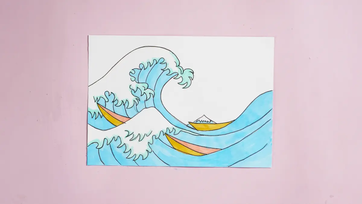
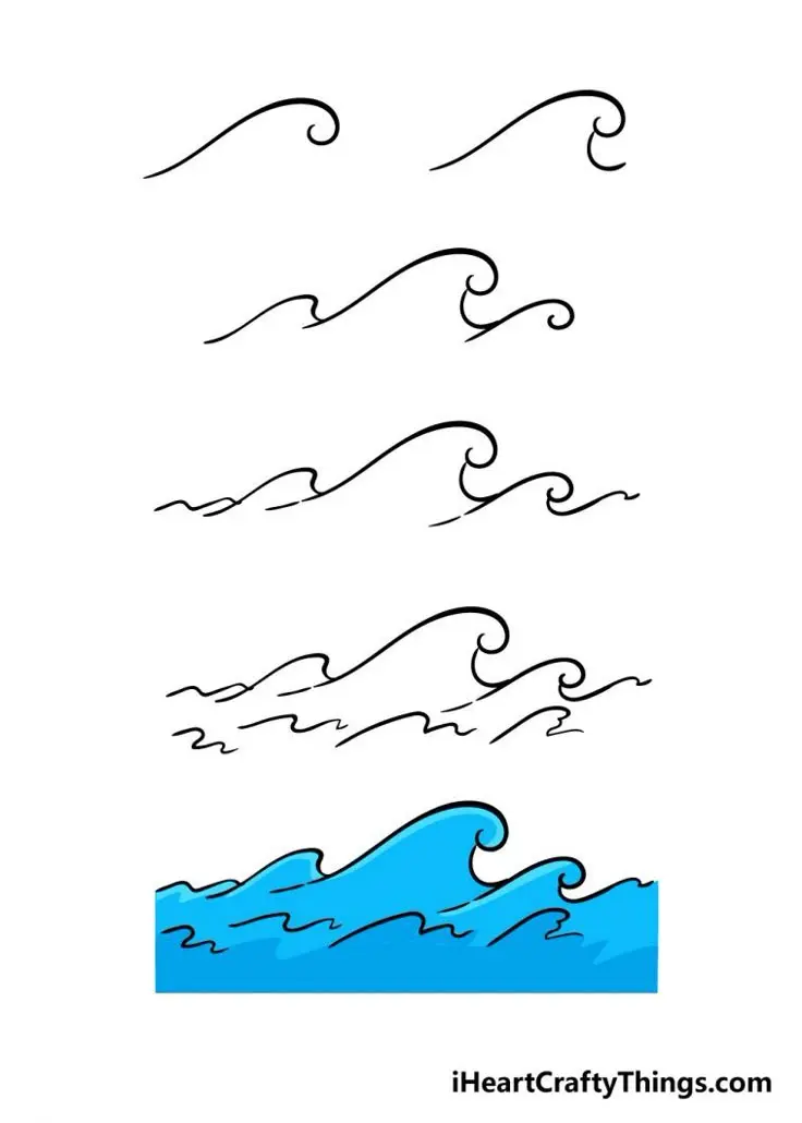
Drawing a wave begins with understanding the fundamental S-curve, which serves as the backbone for almost every water form. Start by drawing a horizontal line to represent the horizon, then sketch a series of gentle, interconnected curves that rise and fall like a roller coaster. These lines define the crests, or the highest points, and the troughs, which are the lowest points of the wave. Keep your initial strokes light, as you will need to refine these shapes into more complex forms later.
Once the basic structure is set, you can add the "curl" or the barrel of the wave. This is achieved by drawing a smaller, tighter arc that overlaps the main crest, suggesting the water is folding over itself. Practice this motion by following these steps:
- Draw a long, flowing horizontal line across your page.
- Add a series of overlapping arches above the line to represent the crests.
- Connect the arches with smooth, tapering lines that flow toward the trough.
- Vary the height and width of these arches to prevent the wave from looking too uniform or artificial.
Best tools for drawing waves
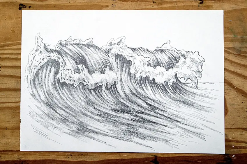
The choice of medium significantly affects the texture and fluidity of your water drawings. Graphite pencils are excellent for beginners because they allow for precise control over shading and line weight. Use an HB pencil for the initial sketch and a darker 4B or 6B pencil to build up the deep shadows under the crests. For those interested in a more dynamic look, charcoal provides a soft, smudged quality that mimics the misty, ethereal nature of sea spray and foam.
If you prefer working with ink or markers, focus on varying your line thickness to create a sense of depth. Thin, delicate lines work well for the distant, calm parts of the ocean, while bold, heavy lines emphasize the power and weight of a breaking wave. Regardless of the tool, keeping your edges sharp where the water meets the air and soft where the water transitions into foam is key. Consider using a kneaded eraser to lift graphite and create highlights, which are essential for showing where light hits the crest.
Why waves look the way they do
Waves are essentially energy traveling through water, not just the water moving forward itself. As a wave approaches the shore, the bottom of the wave experiences friction against the seafloor, which slows it down while the top continues to move quickly. This physical process causes the wave to steepen and eventually collapse, creating the iconic breaking motion we recognize. Observing this physics in nature helps you understand why the crest of a wave often looks thicker and more opaque than the rest of the body.
The appearance of a wave is also dictated by the way light interacts with its surface. When light hits a wave, it reflects off the crests and refracts through the translucent parts of the water. This creates a spectrum of colors and values, ranging from bright white foam to deep, dark blues or greens in the shadows. By studying how light behaves on curved, reflective surfaces, you can better represent the three-dimensional volume of water on a two-dimensional piece of paper.
Common mistakes when drawing waves
One of the most frequent errors is making the wave look too rigid or symmetrical. Water is fluid and chaotic, so avoid drawing perfectly repetitive, identical crests across your entire page. Instead, vary the size and spacing of your waves to reflect the unpredictable nature of the ocean. Another common mistake is neglecting the shadow directly beneath the crest, which is necessary to give the wave its weight and sense of height. Without these dark, contrasting areas, the wave will appear flat and lack the power associated with breaking water.
To improve your technique, avoid these pitfalls:
- Over-detailing every single bubble, which can make the drawing look cluttered.
- Using straight lines, which contradict the natural, organic flow of liquid.
- Failing to establish a consistent light source, leading to confused shading.
- Making the foam look like solid matter rather than a collection of light, airy bubbles.
- Ignoring the perspective of the horizon, which can make the water look like it is sliding off the page.
How to add realistic details to waves
Adding fine details is what transforms a simple sketch into a convincing representation of the sea. Start by focusing on the "white water," or the foam created by the breaking crest. Use small, circular, or stippled marks to suggest the texture of bubbles rather than drawing individual spheres. You can also add "streaks" of water trailing behind the crest to show velocity and direction. These small, directional lines should follow the curve of the wave, reinforcing the sense of movement and energy that defines the ocean's surface.
Finally, consider the environment surrounding the wave to add context. Adding a few birds in the distance or a subtle change in the water's value toward the horizon can ground your drawing in reality. Remember that the water closest to the viewer should have the most detail and the highest contrast, while the water further away should appear softer and less defined. By balancing these elements of detail and atmosphere, you create a compelling image that captures the timeless, rhythmic beauty of the ocean as it crashes against the shore.
Key facts
- Waves are defined by their amplitude (height) and wavelength (distance between crests).
- Use a series of connected "S" curves to establish the rhythmic flow of a wave.
- Vary the thickness of your lines to suggest depth, using heavier strokes for the base.
- Add foam at the crest by using small, jagged circles or irregular "U" shapes.
- Perspective matters: waves appear flatter and more horizontal when viewed from a distance.
- Practice drawing the "curl" or "tube" by overlapping circular arcs to create volume.
The bottom line
Drawing convincing waves requires mastering the rhythm of fluid motion through overlapping curves and strategic shading. By focusing on the interplay between the crest, the trough, and the foam, you can translate the complex physics of water into a simple, visual language. Remember that water is never static; prioritize organic, flowing lines over rigid geometry to capture the true essence of the ocean's dynamic and powerful movement.
People also ask
How do I make water look transparent?
Leave parts of the wave body white or very light, while darkening the area directly beneath the crest. This contrast creates the illusion of light passing through moving water.
Should I use straight or curved lines for waves?
Avoid straight lines, as they make water appear rigid. Use fluid, organic curves that mimic the natural, unpredictable movement of liquid.
How do I show the direction of the wind?
Draw smaller, wispy lines or "spray" blowing off the top of the crest in one consistent direction. This indicates the force acting upon the water surface.
What is the best pencil technique for shading waves?
Use hatching lines that follow the curvature of the wave rather than shading in flat blocks. This reinforces the three-dimensional shape of the water.
How can I draw a crashing wave?
Focus on a large, overhanging arc that breaks into chaotic, irregular shapes at the base. Use heavy shading at the point of impact to show energy.
Why do my waves look like mountains?
You are likely drawing sharp, triangular peaks. Replace those points with rounded, rolling curves to ensure the water looks fluid rather than solid.
This answer was created with the help of AI research tools and reference sources. Spotted an error? Let us know — we correct mistakes quickly. See our editorial policy.