How do you draw an ice cream cone step by step?
Short answer
Drawing an ice cream cone begins by sketching an inverted triangle for the wafer, followed by rounded, overlapping scoops on top. Use light pencil strokes to establish the basic geometry before adding texture. By layering circular shapes and cross-hatching the cone, you create a realistic, appetizing illustration with simple artistic techniques.

On this page
How to draw an ice cream cone step by step
To begin your drawing, start with the structural foundation of the dessert. Use a sharp HB pencil to lightly sketch an inverted triangle, which will serve as the waffle cone. Ensure the point at the bottom is slightly rounded rather than sharp to mimic the shape of a real cone. Once the triangle is set, draw a horizontal line across the top to close the shape.
Next, focus on the ice cream scoops. Draw one or two large, irregular circles sitting directly on top of the cone base. Avoid making these circles perfect; ice cream is soft and malleable, so allow the edges to overlap and sag slightly. You can add a third, smaller scoop on top to create height. Use these steps to build your composition:
- Draw the inverted triangle for the cone.
- Sketch the base scoop as a large, slightly flattened circle.
- Add secondary scoops on top with wavy, organic lines.
- Define the edges of the ice cream to show where it drips over the sides.
Best drawing tools for beginners
For those new to sketching, starting with the right equipment makes the process significantly more manageable. A standard HB graphite pencil is ideal for initial outlines because it is easy to erase if you make a mistake. You should also keep a kneaded eraser nearby, as it allows you to lift graphite off the paper without damaging the surface texture.
When you are ready to finalize your work, consider using archival-quality fine-liner pens. These pens provide consistent ink flow and come in various tip sizes, allowing for both bold outlines and delicate detailing. For the final stage, colored pencils or alcohol-based markers are excellent for adding depth. If you prefer a traditional look, watercolor pencils can create soft, blended transitions that mimic the creamy texture of melting ice cream. Always test your colors on a scrap piece of paper before applying them to your final drawing to ensure the shades match your vision.
How to add texture to the cone
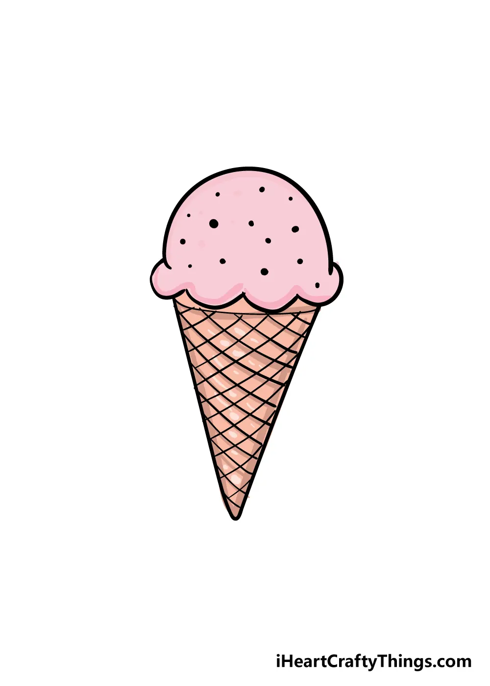
The waffle cone is defined by its distinct grid pattern, which adds visual interest and realism to your drawing. Once your basic triangle is established, draw a series of diagonal lines slanting downward from left to right across the entire surface. Then, draw a second set of diagonal lines slanting in the opposite direction to create a diamond-shaped grid.
To enhance this texture, apply slightly more pressure at the intersections of the grid lines. This creates the illusion of depth, making the cone appear three-dimensional rather than flat. You can also add small, curved lines along the rim of the cone to show thickness. If you want to make the cone look crunchy, use short, quick strokes to add minor imperfections or small dots within the diamond shapes. These subtle details prevent the cone from looking like a perfect, sterile geometric shape and give it a more natural, handcrafted appearance.
Why ice cream drawings look unrealistic
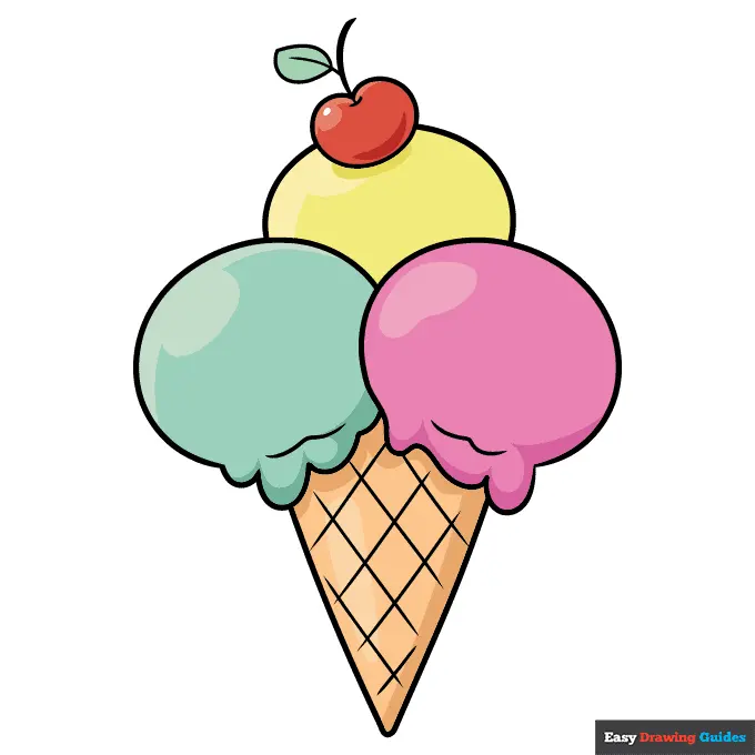
A common issue in ice cream illustrations is the lack of gravity-based movement. Real ice cream melts and drips, so your drawing should reflect this organic process. If your scoops look like rigid spheres, they will appear stiff and unnatural. Instead, draw the edges of the scoops with soft, wavy lines that suggest the weight of the ice cream pushing down toward the cone.
Another reason drawings may look flat is a lack of shading. To fix this, identify a light source—for example, the top-right corner—and keep that side of your scoops brighter. Use cross-hatching or soft blending on the opposite side to create shadows. This technique helps define the volume of the scoops. Additionally, ensure the drips are placed logically; they should follow the contours of the cone and pool slightly at the bottom if the ice cream is melting quickly. By observing how light hits curved surfaces, you can add highlights that make the scoops look cold and creamy.
Common mistakes when drawing food
One frequent error is making the ice cream scoops too symmetrical. In nature, food is rarely perfect, and forcing symmetry often makes the drawing look like a cartoon icon rather than a realistic dessert. Embrace asymmetry by varying the size and shape of each scoop, and don't be afraid to let one scoop lean further to one side than the other.
Another mistake is neglecting the connection point between the cone and the ice cream. Beginners often draw the scoops sitting perfectly on top of the cone, but in reality, the ice cream should slightly overlap the rim. Use these tips to avoid common pitfalls:
- Avoid heavy, dark outlines that make the drawing look like a coloring book page.
- Do not forget to include a shadow cast by the cone on the surface below.
- Ensure the texture of the cone is consistent across the entire shape.
- Use variety in your line weight to emphasize the foreground elements over the background.
By focusing on these details, you will create a professional, polished illustration that captures the essence of the subject while maintaining a clean, artistic style.
Key facts
- Start by drawing an inverted triangle to serve as the base for the waffle cone.
- Use a series of diagonal intersecting lines to create the classic waffle texture on the cone.
- Draw a large, slightly wavy semicircle on top of the cone to represent the first scoop of ice cream.
- Add smaller, overlapping semicircles above the first scoop if you wish to draw a multi-scoop sundae.
- Include a small, teardrop-shaped circle at the very top to represent a cherry.
- Use a darker shade or cross-hatching at the bottom of the scoops to imply shadows and depth.
The bottom line
Drawing an ice cream cone is an excellent exercise in basic geometric construction and shading. By starting with simple shapes like triangles and circles, you can build a complex, appealing illustration. Focus on maintaining symmetry in the cone and adding varied textures to the ice cream to create a professional look. With consistent practice, you will master the proportions required to draw delicious-looking frozen treats easily.
People also ask
What is the best tool for drawing ice cream cones?
A graphite pencil with an eraser is ideal for beginners because it allows for light sketching and corrections. Once the outline is set, you can use fine-liner pens to create crisp, permanent edges.
How do I make the ice cream look like it is melting?
Draw irregular, dripping shapes that hang over the edge of the cone. Adding small puddles at the base of the scoop helps convey a realistic, melting effect.
Should I draw the cone or the ice cream first?
It is generally easier to draw the cone first to establish the foundation and balance of the drawing. This ensures the scoops are centered and proportional to the base.
How do I add sprinkles to my drawing?
Use short, thin dashes of varying colors across the surface of the ice cream scoops. Keep them spaced out to ensure they do not look cluttered or messy.
Why does my cone look lopsided?
This often happens when the triangle base is not symmetrical. Use a light vertical guideline down the center of your paper to keep both sides of the cone even.
Can I use colored pencils for this drawing?
Colored pencils are excellent for adding texture and highlights to the ice cream. Layering lighter colors over darker ones can help create a sense of volume and creaminess.
This answer was created with the help of AI research tools and reference sources. Spotted an error? Let us know — we correct mistakes quickly. See our editorial policy.