How do you draw an anchor?
Short answer
Drawing a classic nautical anchor involves sketching a central vertical shank, a horizontal crossbar at the top, and two curved arms ending in pointed flukes at the base. By establishing a symmetrical skeleton first, you can easily build up the structural thickness and add defining details like the circular ring and crown.
On this page
How to draw a basic anchor for beginners
To begin, draw a long, thin vertical line to serve as the shank. Place a horizontal line near the top for the stock, ensuring it is perpendicular to the shank. At the bottom of the shank, draw a wide, shallow "U" shape or a crescent to form the arms. This basic wireframe ensures your drawing remains symmetrical and balanced before you add any weight or dimension to the shape.
When you are ready to add depth, follow these steps to refine the outline:
- Thicken the vertical shank by drawing a parallel line on either side, tapering it slightly toward the top.
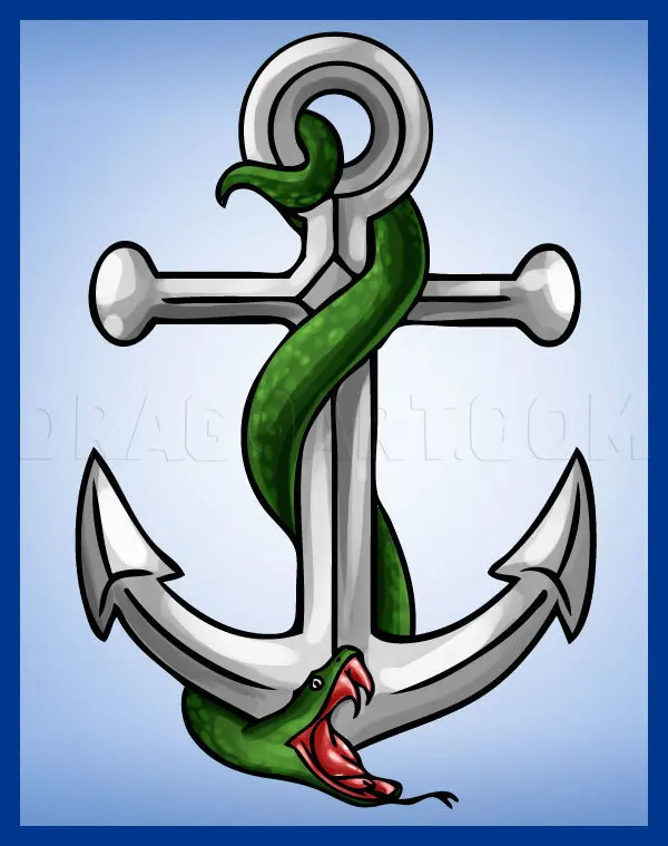
- Add a circle at the very top of the shank to represent the anchor ring used for the chain.
- Draw thick, triangular flukes at the ends of the curved arms, pointing outward.
- Add a small diamond or circular shape at the bottom center, known as the crown, where the arms meet the shank.
- Erase your initial guide lines to reveal a clean, professional-looking anchor silhouette.
How to add realistic detail and texture
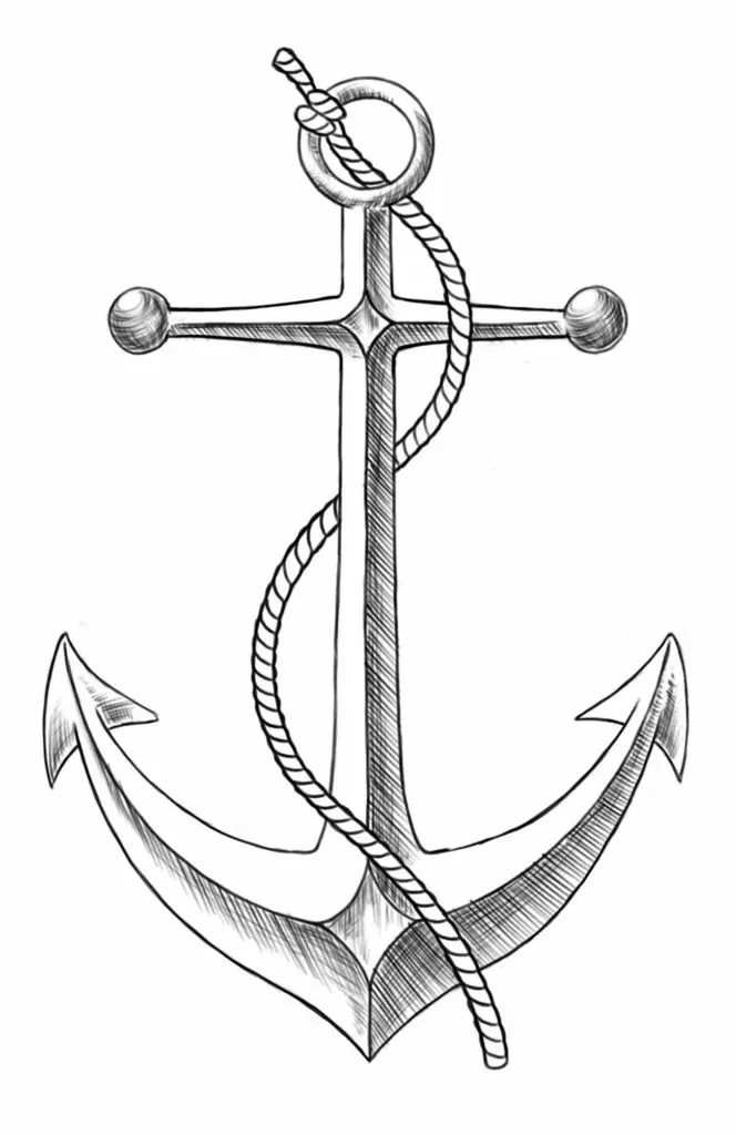
Once the basic structure is complete, you can enhance the drawing by adding shading and texture. Anchors are typically made of heavy cast iron or steel, which often appear weathered or pitted. Use a graphite pencil to apply light cross-hatching along one side of the shank and the flukes to suggest a light source. This simple technique creates the illusion of a three-dimensional object rather than a flat, two-dimensional drawing.
To make the anchor look authentic, consider adding these visual elements:
- Scratches or small dots on the surface to mimic rust and wear.
- A slight bevel on the edges of the flukes to show they are sharp and functional.
- A heavy chain attached to the top ring, drawn with interlocking oval links that get smaller as they move away from the viewer.
- A subtle shadow cast on the ground beneath the anchor to ground it in the space.
Why symmetry is essential for drawing anchors
An anchor is a functional tool designed for balance and stability, so its visual representation relies heavily on symmetry. If one arm is longer than the other or the stock is tilted, the entire drawing will look distorted or unstable. Beginners often struggle with this because the human eye is very sensitive to slight variations in mirrored shapes. Using a ruler or light guide lines during the initial sketching phase is the most effective way to ensure both sides match perfectly.
If you find your drawing looks lopsided, check your work by holding the paper up to a mirror or flipping it horizontally if you are using digital tools. You will immediately spot which side is wider or angled incorrectly. Correcting these errors early is much easier than trying to fix them after you have added shading or final ink lines. Consistent practice with basic geometric shapes will eventually train your hand to draw these symmetrical forms without needing extensive guide lines.
How to choose the right anchor style to draw
There are many types of anchors, and choosing the right one can change the complexity of your drawing. The most recognizable version is the Admiralty pattern, which features a large stock and curved arms. However, modern anchors like the Danforth or the Plow anchor have very different, more angular designs. If you are a beginner, the Admiralty style is the best choice because its parts are distinct and easy to break down into simple geometric components.
Consider these different styles based on your skill level:
- Admiralty: Classic, symmetrical, and perfect for learning basic structure.
- Danforth: Flat, plate-like flukes that require more attention to perspective.
- Plow: A single, curved spade-like shape that is excellent for practicing organic, flowing lines.
- Mushroom: A simple, rounded shape that is ideal for minimalist or stylized drawings.
Experimenting with these different types will help you understand how mechanical design influences the visual weight and character of your artwork.
Common mistakes when drawing anchors
One of the most frequent errors is making the anchor ring too small or too thin. In reality, the ring must be large enough to accommodate a heavy chain, and it should look sturdy enough to hold the weight of the entire vessel. Another common issue is drawing the flukes at the wrong angle; they should always point back toward the shank to ensure they can "bite" into the seabed. If the flukes point straight out, the anchor loses its functional logic and looks like a decorative prop rather than a maritime tool.
Avoid these common pitfalls to improve your results:
- Drawing the stock too short, which makes the anchor look like it would easily roll over.
- Forgetting to connect the arms to the shank with a distinct crown, which makes the structure look disconnected.
- Adding too much detail, which can clutter the drawing and obscure the anchor's clean, iconic silhouette.
- Ignoring the thickness of the metal, resulting in a drawing that looks like it was made of thin wire.
By focusing on the structural integrity of each part, you will create a drawing that is both aesthetically pleasing and technically believable.
Key facts
- A classic Admiralty anchor consists of a central shank, two curved arms, and triangular flukes at the ends.
- Start by drawing a long vertical line for the shank, topped with a horizontal bar called a stock.
- The flukes are the pointed parts that dig into the seabed to hold a vessel in place.
- Use a compass or a circular object to ensure the curved arms are symmetrical on both sides.
- Avoid drawing the flukes too small, as they need significant surface area to provide holding power.
- Adding a small circle at the top of the shank represents the ring used to attach the anchor chain.
The bottom line
Drawing a classic anchor is a matter of balancing geometric precision with functional design. By establishing a strong vertical shank and a perpendicular stock, you create the necessary framework for the curved arms and flukes. Focus on symmetry and structural logic to ensure your depiction looks capable of holding a ship. With these simple steps, you can master the iconic silhouette of this essential maritime tool.
People also ask
What is the purpose of the horizontal bar at the top of an anchor?
This bar is called the stock. It ensures that when the anchor hits the bottom, it tips over so that at least one fluke digs into the ground.
Are there different styles of anchors for drawing?
Yes, anchors range from the traditional Admiralty style to modern plow or claw anchors. Each has a distinct shape suited for different types of seafloor terrain.
Should I use a ruler when sketching an anchor?
Using a ruler for the shank and stock helps maintain structural integrity and professional proportions. Freehand drawing is better suited for the curved arms to give them a natural, organic look.
Why do anchors have a ring at the top?
The ring, or shackle, is the connection point for the anchor rode or chain. Without this, the anchor could not be deployed or retrieved by a vessel.
How can I make an anchor drawing look more realistic?
Add shading along one side of the shank and the flukes to create depth. Metallic surfaces reflect light, so leave a thin white highlight along the edges to suggest steel.
What is the most common mistake when drawing an anchor?
The most frequent error is making the arms too thin or misaligning the flukes. If the flukes do not point toward the shank, the anchor would appear non-functional in a real-world scenario.
This answer was created with the help of AI research tools and reference sources. Spotted an error? Let us know — we correct mistakes quickly. See our editorial policy.