How do you draw a knight?
Short answer
Drawing a knight requires breaking the complex armor into simple geometric shapes. Start by sketching a mannequin-like skeleton to establish the pose, then layer the metal plates over the limbs. Focus on the iconic silhouette of the helmet and the weight of the sword to give your character a realistic, heroic presence.
On this page
How to structure a knight sketch
The foundation of a convincing knight is a solid gesture drawing. Begin by sketching a simple stick figure with circles for the joints to determine the action of the pose. A knight in a combat stance should have a low center of gravity, so bend the knees slightly and tilt the torso to suggest weight. Once the pose is set, build "tubes" around the limbs to represent the thickness of the armor. This mannequin stage prevents the anatomy from looking distorted once you add the bulky metal plates.
- Draw a vertical line for the spine to establish the character's posture.
- Place an oval for the torso and a smaller circle for the head.
- Use simple cylinders for the arms and legs, ensuring they are proportional to the torso.
- Add small spheres at the shoulders, elbows, and knees to mark articulation points.
Keep your initial lines very light so they are easy to erase or refine later. Establishing these proportions early ensures that the finished armor does not look too small or too large for the body.
What are the essential parts of armor
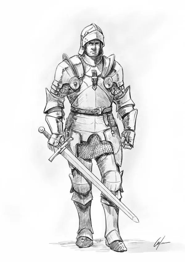
To make your drawing look authentic, you must understand the basic components of 15th-century plate armor. A knight is not just a person in a metal suit; it is a collection of articulated plates designed to protect vulnerable areas while allowing movement. Focus on these distinct pieces to add realism to your illustration:
- The Bascinet or Great Helm: The headpiece that defines the knight's silhouette.
- The Cuirass: The breastplate and backplate that protect the torso.
- The Pauldrons: Large, rounded plates that cover and protect the shoulder joints.
- The Gauntlets: Segmented metal gloves that allow for finger movement.
- The Greaves and Sabatons: Protection for the lower legs and feet respectively.
By identifying these parts, you avoid the common mistake of drawing armor as a single, solid piece of metal, which would be impossible to wear in reality.
How to draw realistic metal textures
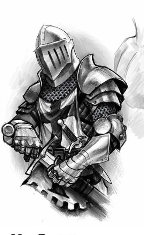
Rendering metal is all about high-contrast lighting and sharp reflections. Because armor is highly polished, it reflects the environment around it, creating bright highlights and deep shadows. Use a hard pencil or a sharp digital brush to create crisp edges where the metal plates meet. Place your primary light source clearly, and ensure that all highlights on the armor follow that same direction. Avoid using soft, blurry shading, as this makes the material look like plastic or rubber rather than cold, hard steel.
When shading, remember that metal has a "specular" quality. This means you should leave thin, white lines along the edges of the plates to represent the reflection of the sky or ambient light. Deepen the shadows in the crevices where two plates overlap, as these areas receive the least light. A well-placed highlight on the curve of a breastplate or the ridge of a helmet will immediately make the armor pop off the page and look three-dimensional.
Common mistakes when drawing knights
The most frequent error is neglecting the articulation of the joints. Beginners often draw the armor as a rigid shell, which makes the knight look like a statue rather than a warrior. Always ensure there is a gap or a series of overlapping "lames"—small strips of metal—at the elbows, knees, and waist. These gaps are necessary for the knight to bend their limbs. Without them, the character loses all sense of mobility and appears stiff.
Another common mistake is ignoring the weight of the equipment. A full suit of plate armor weighs between 30 and 50 pounds, and a longsword adds several more. If the knight is standing, their feet should be planted firmly on the ground, and their posture should reflect the effort of carrying that weight. Avoid drawing the knight in a floating or weightless pose. By grounding the figure and showing the bulk of the armor, you create a sense of realism that makes the character feel powerful and prepared for battle.
Best tips for adding accessories
A knight is defined by their gear, so the final details are crucial for storytelling. A sword should be drawn with a straight, rigid line to emphasize its sharpness, while a shield can be used to add a focal point for heraldry or emblems. When drawing a cape or surcoat, use flowing, curved lines that contrast with the rigid, straight lines of the metal armor. This contrast makes the armor look even harder and more durable by comparison.
- Add a belt or leather straps to suggest how the armor is attached to the body.
- Include a scabbard for the sword to show where the weapon is stored when not in use.
- Use heraldic designs on the shield or chest to give the knight a unique identity.
- Add scuffs, scratches, or minor dents to the metal to imply that the knight has seen actual combat.
These small details transform a generic armored figure into a specific character with a history, making your drawing much more engaging for the viewer.
Key facts
- Start by sketching a basic stick figure to establish the knight's pose and proportion before adding armor.
- Focus on the silhouette of the helmet, such as the iconic "great helm" or "bascinet," to define the era.
- Remember that plate armor is composed of articulated metal plates that follow the natural joints of the human body.
- Use geometric shapes like cylinders for limbs and ovals for the chest plate to build volume.
- Add a surcoat or tabard over the armor to provide color, texture, and a sense of movement.
- Always include a weapon, such as a longsword or lance, held at a realistic angle to show weight and balance.
The bottom line
Drawing a convincing knight requires a balance between anatomical accuracy and the rigid geometry of historical armor. By starting with a skeletal framework and layering articulated plates over the joints, you create a character that feels both formidable and functional. Remember to use sharp highlights to mimic steel and pay close attention to the weight of the equipment to bring your armored figure to life.
People also ask
What is the most common mistake when drawing armor?
The most frequent error is drawing armor as a single, rigid shell that prevents movement. Real plate armor features overlapping plates at the elbows, knees, and waist to allow the wearer to bend.
How do I make the armor look like metal?
Use high-contrast shading to represent light reflecting off curved surfaces. Place bright white highlights on the edges and deep black shadows in the crevices to create a metallic sheen.
Should a knight always wear a full suit of armor?
Not necessarily, as armor evolved significantly between the 12th and 15th centuries. Early knights wore chainmail, while later knights wore full plate, so match your drawing to the specific historical period.
How do I draw a knight on horseback?
Draw the horse first as a separate, muscular creature before placing the knight on top. Ensure the knight’s legs are positioned to grip the saddle rather than just hanging straight down.
Do knights always need capes?
Capes were often worn for status or protection from the elements, but they are not strictly necessary. If you include one, draw it flowing away from the movement to add dynamic energy to your illustration.
How can I show that the armor is heavy?
Emphasize a wide, stable stance with the feet planted firmly on the ground. A knight carrying heavy steel should look grounded and slightly hunched rather than light or floating.
This answer was created with the help of AI research tools and reference sources. Spotted an error? Let us know — we correct mistakes quickly. See our editorial policy.